Counter app – User Testing

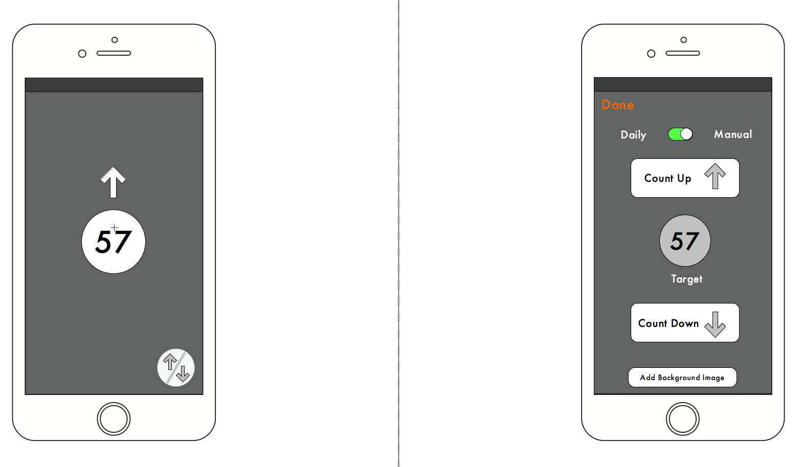
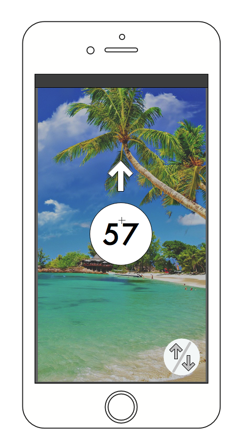
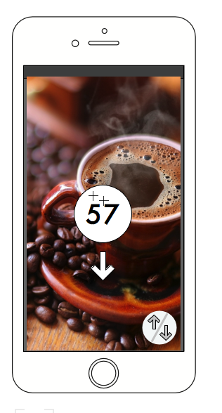
Our next assignment was to user test with the app we made. I used the functional prototype I made from proto.io to do this.

I had a lot of fun doing this. One of the challenges was making the prototype functional enough. People with smart phones are inherently used to things working smoothly, so the prototype’s functionality had to be as accurate as possible.

https://vimeo.com/207486741

It was also a humbling experience to find out what people did not like. After my first user testing, I went back and made some changes:

https://vimeo.com/207486661

https://vimeo.com/207486926

iPhone Counter App – working prototype

Our next assignment was to make our prototype for the counter app a little more functional. I decided to use proto.io to mock it up as a mobile app. It was a lot of fun to learn how powerful proto.io is in terms of making functional prototypes!

Here is a quick video of the counter app’s basic functionality:

https://vimeo.com/207378528

Counter Assignment – iPhone app


Our next iteration of the counter assignment was an app for a mobile phone.

The app allows a user to count up or count down, and to set a target to count towards.

I want my counter to “spin” to the current number when the app is opened. This should happen in three seconds regardless of the number. So if the counter is at 5, then it would take three seconds to arrive at 5. If the current number is 75, then it will take three seconds to arrive at 75.

I thought it would also be nice to give the option to add a background image to remind the user what they are counting for.


Designing Meaningful Interactions

IMG_5587IMG_5587This week we looked at some interactions that we enjoy and don’t enjoy.

In my personal work, I end up using a lot of different hand tools. Most of them have interactions that I love, as I’ve stuck with things I like and gotten rid of things I don’t.

One of my favorite interactions for a tool is one of my screwdrivers made by Wera:

https://vimeo.com/202061123

One interaction I cant stand is the new unlock interface on the iphone

I really miss the sliding touch from the interface. Now there are too many controls from the one button. I find it very cluttered and hard to operate when Im walking or multitasking. The basic operation is lost because of this, which is to unlock the phone.

Why is this interface gone?