Color Composition

This week we explored color. We were asked to make a composition using color. I started out by taking the hue test:

Screen Shot 2015-10-08 at 10.41.53 PM

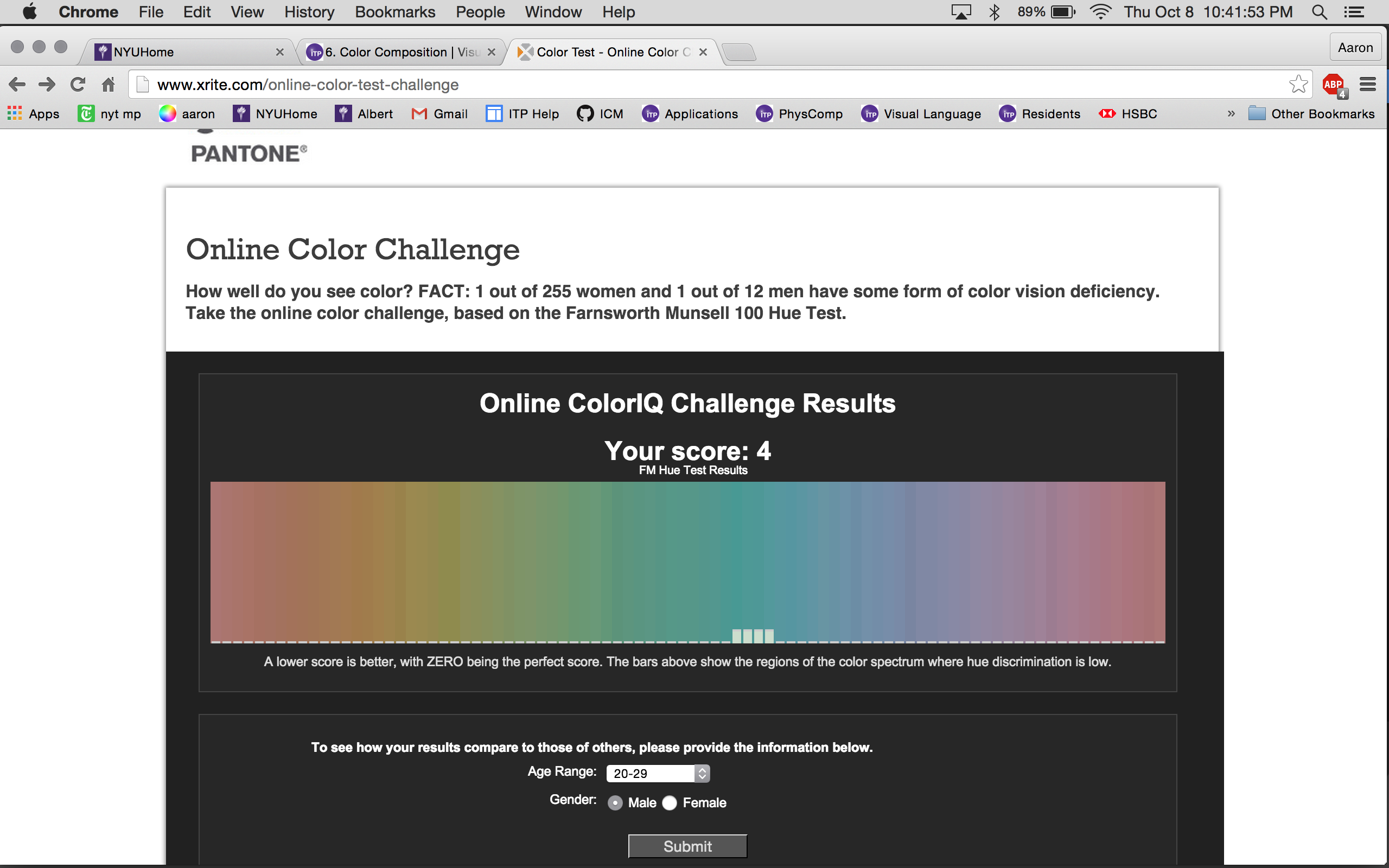
I wonder if I would do any better with my calibrated monitor at home?

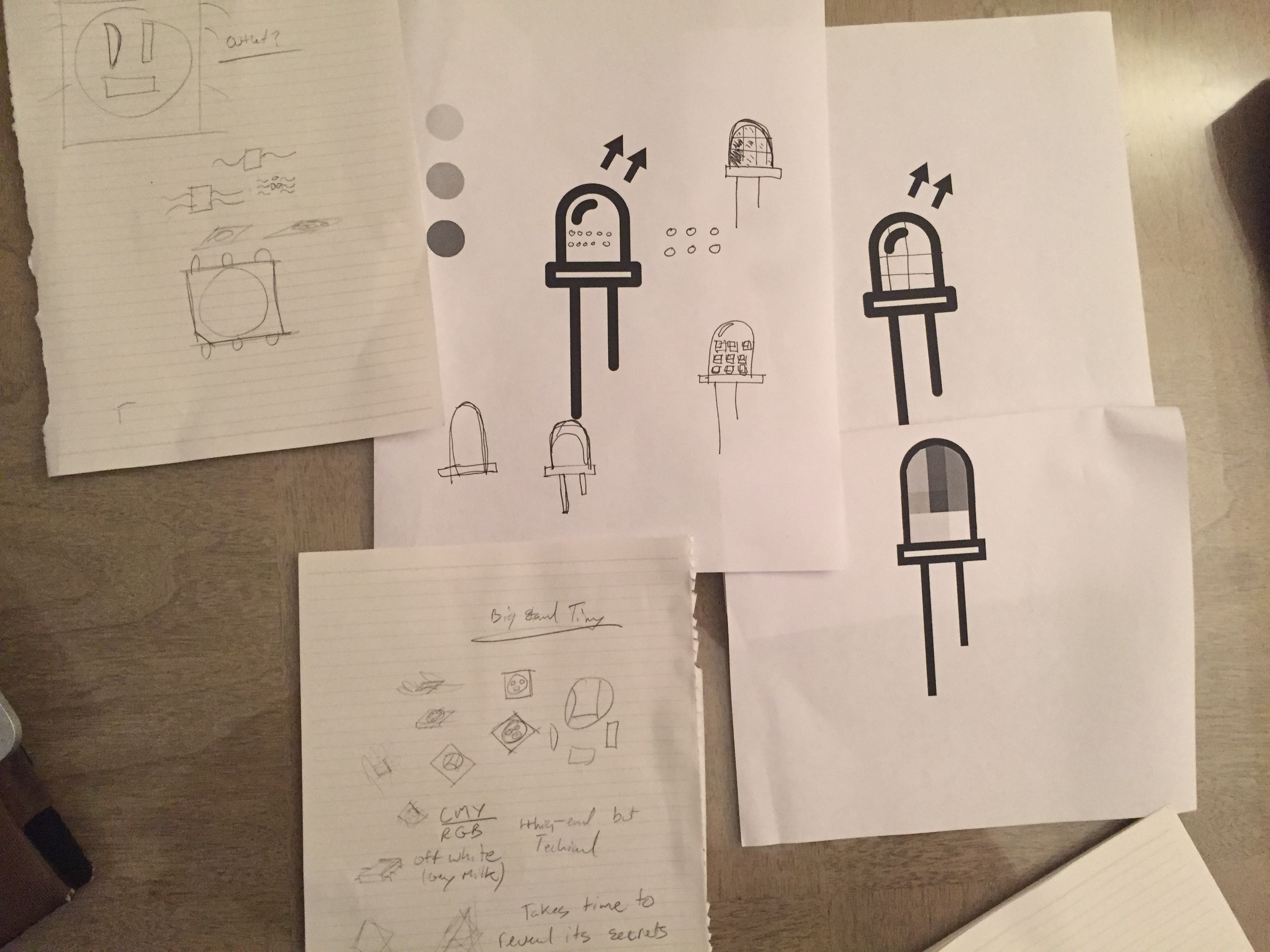
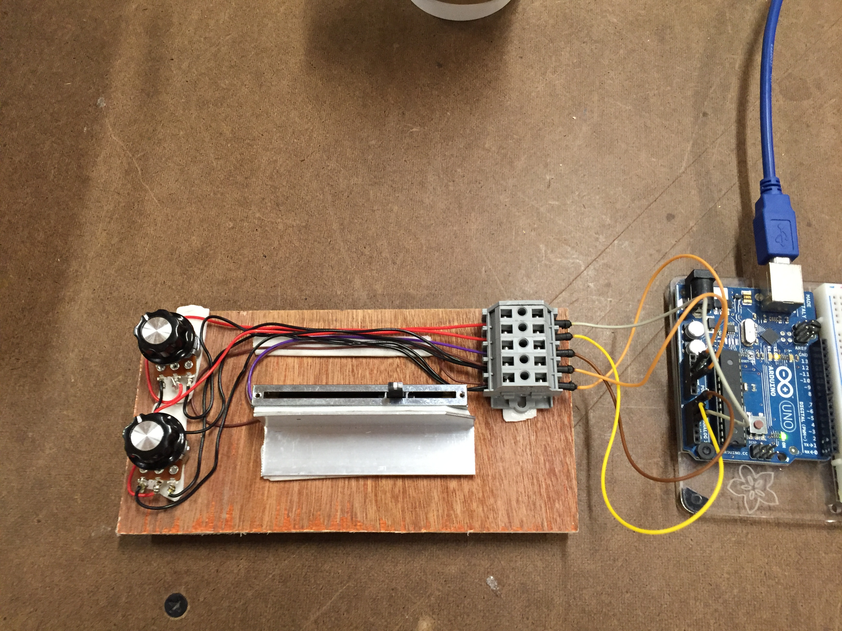
Next I decided I wanted to do some physical control to manipulate the hue, saturation, and brightness of my ‘composition’  – since it would be very related to how I want to use my programming knowledge as a lighting designer.

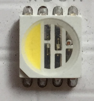
I started out by trying to use some addressable LED tape that I had. This turned very frustrating very quickly. The library used to control this tape is no cake-walk, and I found myself in over my head after two days of messing with it.

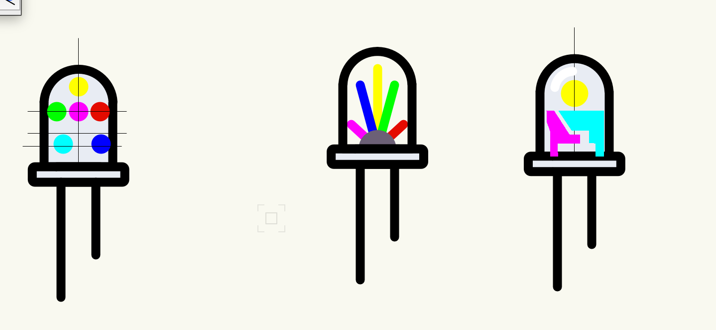
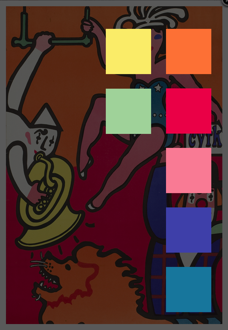
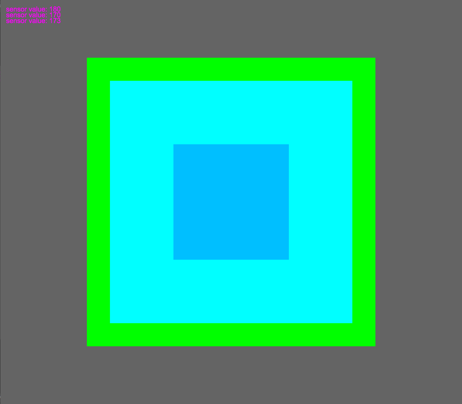
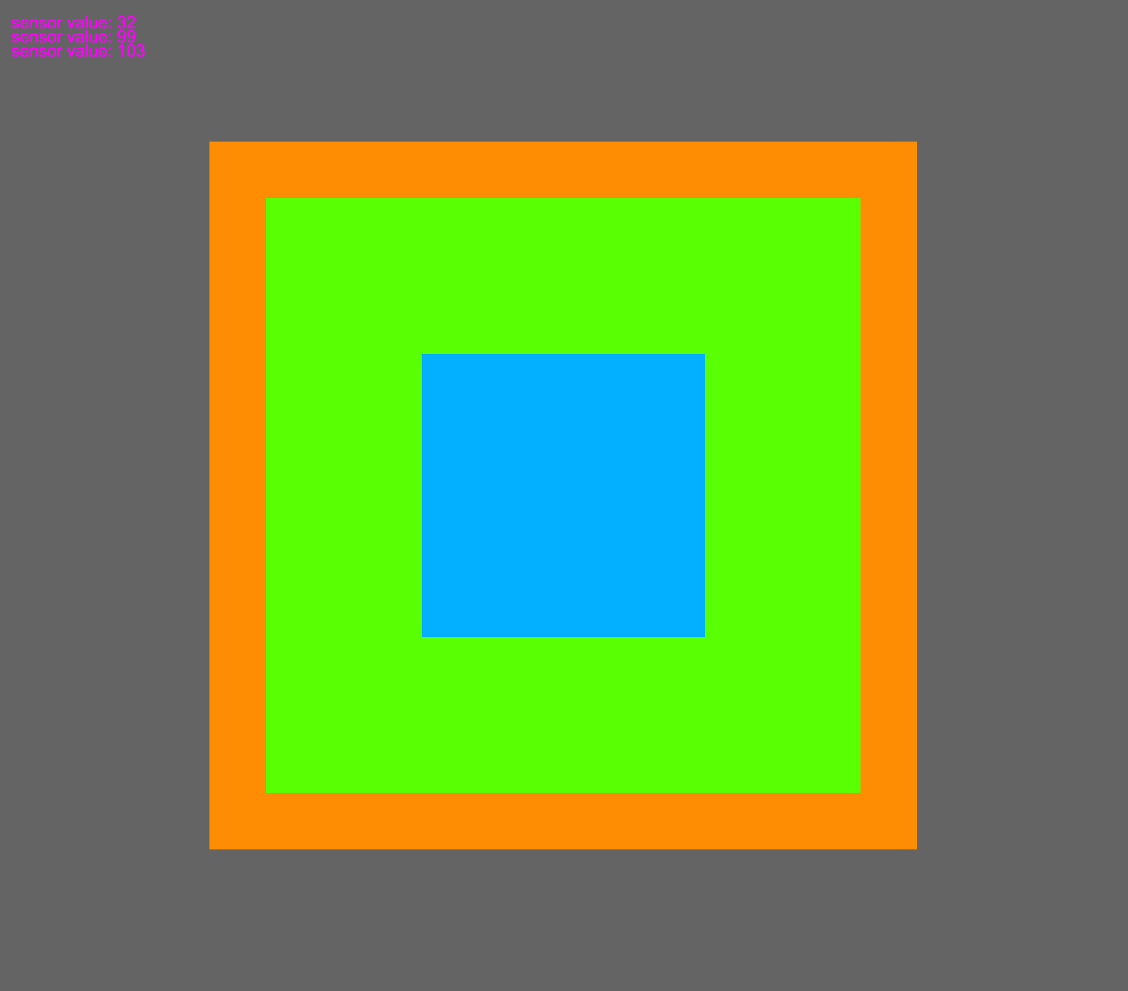
I turned to a slightly simpler route and used p5 and an arduino to change the H/S/B of some squares on screen via a slider and two knobs.

IMG_1081


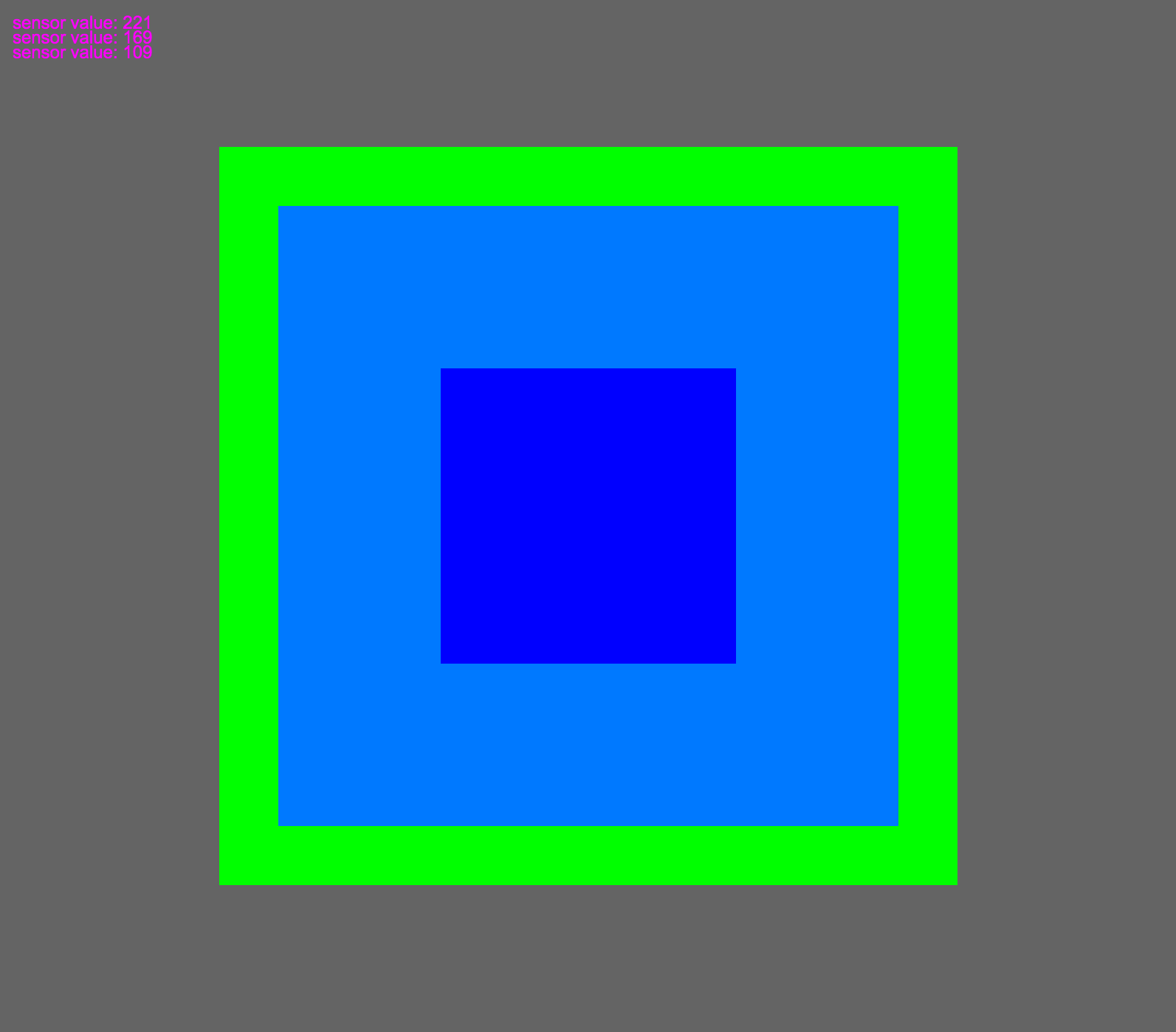
Here are some of the outputs:

ss3


ss2


ss1

And a video:

4th Assignment – Business cards

This week we designed business cards for ourselves. I decided early-on that I wanted to do something simple. Since our typography class I have taken a liking to Futura and how my name looks set in it.

FullSizeRender 6

I also checked out Kandinsky’s book on composition. It was an interesting read, but some of it came off as drawing meaning out of thin-air. Mel Brooks comes to mind!

Back to the business card – I found myself working in circles quite a bit on this one. I decided to use my logo from the previous week, along with icons of light bulbs that I found on thenounproject.com which I then modified. The original icons were designed by Eli Ratus (https://thenounproject.com/mordarius/collection/light-bulb-socket-standards/)

I tried quite a few different designs!

IMG_1045 2

I ended up with inkjet prints on matte presentation paper that I cut out and folded in half.

IMG_1047


Here is the finished product for now:

biz_card3


Logo design

This week we learned about logo design. We started this assignment by identifying a logo that we feel is successful. I chose Saul Bass’s logo for Bell Telephone. For many years I’ve enjoyed this logo. I think its simplicity is timeless. In fact it has outlived the company it was designed for. Here is a lineage of  Bell Telephone’s logos, with Saul Bass’s version second from the right:

FullSizeRender

Even though AT&T bell telephone was broken up in 1984, Saul’s logo lives on! Hidden on verizon equipment you can still find it. Verizon employees still hold their allegiance to Ma Bell.

VerizonBell

11874696676_fa16a83961_b

Visually I think this logo is very successful. It takes Alexander Graham Bell’s surname, tied with a functional bell, and yet gives it a cutting-edge simplicity that to me relates it to electronic schematic:

3873593_orig


I also find the light blue Saul chose to be very eye-catching.


2000px-Bell_System_hires_1969_logo_blue.svg


We also designed a logo for ourselves. Early on I experimented with electrical schematic symbols, lighting drafting symbols – things which describe me and my work. I decided that an LED would be a good start. I wanted to use a square RGB LED, as I use these quite often at work – but I didn’t find them to be legible enough to get the point across to laymen.

IMG_0993


I then moved to the more classic LED. I think it is more identifiable:

IMG_0995

I started sketching with both:

IMG_0999

I wanted to use some color, as a lot of my LED work involves color. Almost all of the time LED color is described as RGB, so I wanted to add on this by using CMY as well.

screen


My “final” logo is below. I would really like to spend a lot more time on it, but I think it is a good start! I don’t know if Saul Bass would approve. . .


logo


3rd Assignment – Typography

This week we looked at different typefaces. We were asked to set our name in six different typefaces that say something about us or our name. Having the letter ‘a’ twice in the beginning of my name, and a strange last name gave me plenty to experiment with. I kept my choices simple, but they are all types that I really enjoy, or have used extensively in the past.

aaron1

aaron2

aaron3

aaron4

aaron5

aaron6 copy

Here they are all together:

aaron


Next we were asked to create some expressive words. ‘Gusset’ was born out of a conversation with my roommate about technical engineering terms. Wouldn’t it be great to make a whole dictionary of technical terms where the words were visual representations of what they were?

flange


binary_Ft


crappy


2nd Assignment – Signage

This week we were asked to pick three examples of signage around the city that we felt was unsuccessful, and one that we like.

I have to say the first part of this assignment is almost too easy in NY:

FullSizeRender 3

I find this sign unsuccessful because the phrase ‘Human Hair’ doesn’t really make me feel beautiful. . .


FullSizeRender 2

This is one of my favorite unsuccessful signs that I constantly see at work. They are affixed to scissor lifts below waist level. Poor viewing placement aside, a lot of the rules are depicted confusingly, and some are just beyond obvious: (Don’t fall out of the lift). Its also pretty visually frustrating that they couldn’t come up with ONE more rule to make this thing symmetrical. There are three wind/storm-related rules, I could imagine it wouldn’t be too hard to come up with one more no-no. Maybe you are supposed to draw your own?


Somehow I knew the award for best-worst sign I would see would go to the MTA . . . .

IMG_0759 2

This sign is unsuccessful for two reasons. It definitely wins the “Not my Job” award for starters. An installer measured subway car doors off the first car marker and no solution was come up with where the doors align with a pole in the station. Regardless of the pole being in the way, in terms of directing people this sign is also useless . As a New Yorker I get that you are supposed to stand to the sides of the subway doors and let people off. Why is this information in the same block of yellow with the three arrows? Am I supposed to ‘step aside’ by backing up? The two white arrows aren’t much use either.

My version is pretty simple. The main change is that I am suggesting people walk into the brighter section instead of the black bars on the MTA version.

NEW_SIGN


Luckily there is hope for NYC in some places. I live in Greenpoint, Brooklyn next to several signage studios that hand paint advertisements. This is certainly a lost art. I really enjoy watching them paint these murals and signs. It gives a brand / logo / idea a different quality. As someone who tries to ignore ads as much as possible by not owning a TV, hating the radio, putting three ad-blockers on all my web browsers – I find that I cant help myself but to look at and enjoy the work these studios do. They also often times help businesses in my community by paining murals on the weekend. Such as this one:

IMG_0837

1st Assignment – Choose a design

CYRK Poster

001poster

The design I chose was a poster made for the circus in Poland. Following WWII, the polish government wanted to revamp the image of the circus in a modern fashion, and show off the arts and culture that were government sponsored at the time. I like this poster because it is a lively expression of circus shown in bright colors and smiles. It can be identified quickly from afar, and Im sure its colorful spirit was helpful on fences covering buildings damaged during the war.


001grid_system

Here I have outlined some of the underlining composition. The form of the performers arms, legs, and faces fit these guides very well.


negative_space

In this copy I have substituted the negative space with neutral grey. The cut-out style of the illustration makes for heavy contrast between the negative space and the other elements of the poster.


hierarchy


To me the hierarchy in this work begins with the smiling expressions of the performers, followed by the ‘Cyrk’ text (circus in Polish).


7colors


The seven vibrant colors used are a great representation of the subject matter, and successfully draw the viewer into a fun scene from afar.


Screen Shot 2015-09-08 at 12.13.15 PM copy


Finally, the single font used in this poster is a tough one to pinpoint. It has been heavily compressed and manipulated. I believe it is routed in Goudy Old Style, a serif typeface.

Goudy-Old-Style