This week we were asked to pick three examples of signage around the city that we felt was unsuccessful, and one that we like.
I have to say the first part of this assignment is almost too easy in NY:

I find this sign unsuccessful because the phrase ‘Human Hair’ doesn’t really make me feel beautiful. . .
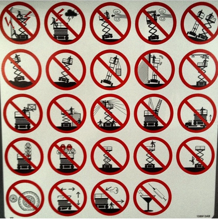
This is one of my favorite unsuccessful signs that I constantly see at work. They are affixed to scissor lifts below waist level. Poor viewing placement aside, a lot of the rules are depicted confusingly, and some are just beyond obvious: (Don’t fall out of the lift). Its also pretty visually frustrating that they couldn’t come up with ONE more rule to make this thing symmetrical. There are three wind/storm-related rules, I could imagine it wouldn’t be too hard to come up with one more no-no. Maybe you are supposed to draw your own?
Somehow I knew the award for best-worst sign I would see would go to the MTA . . . .
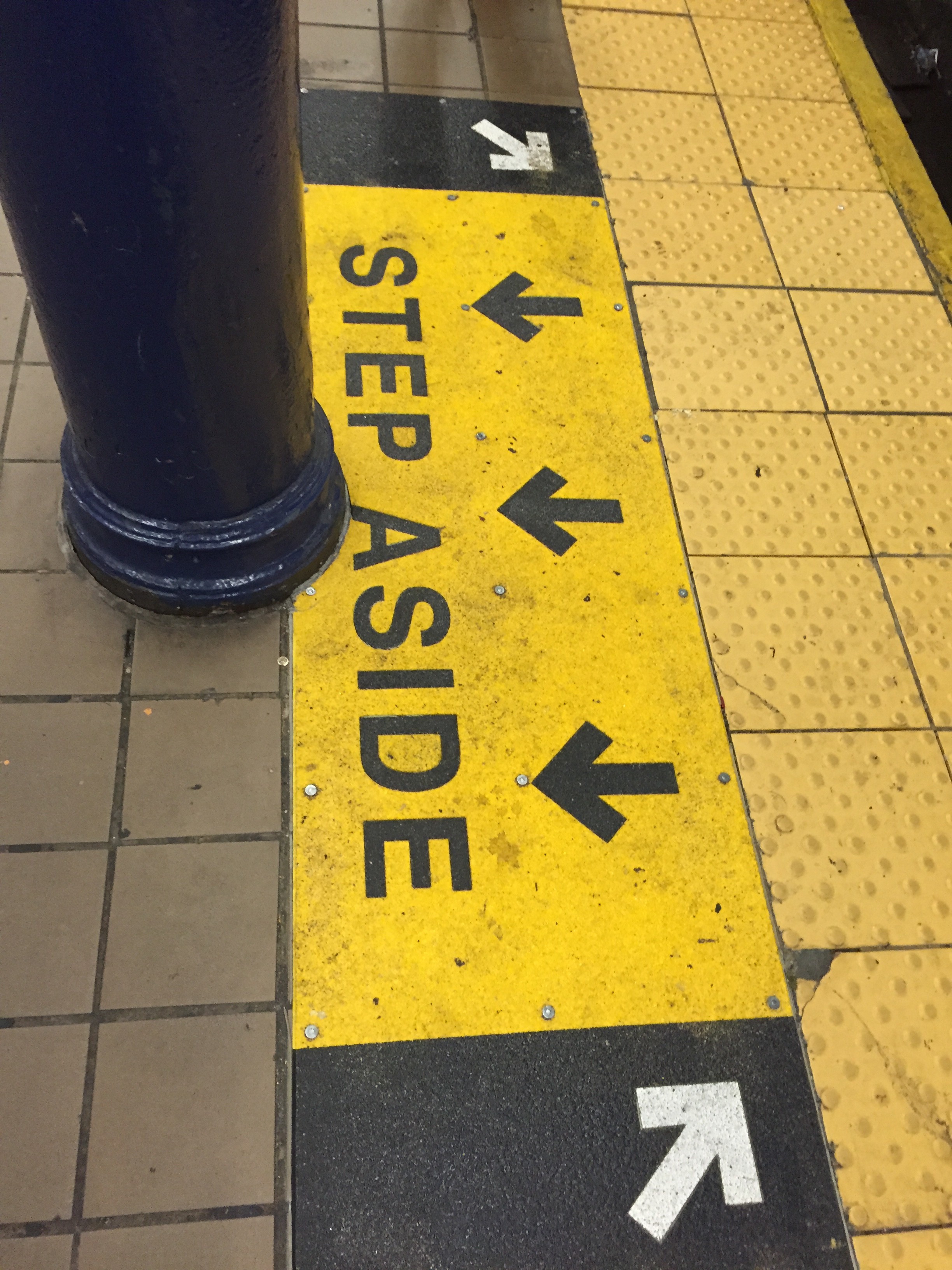
This sign is unsuccessful for two reasons. It definitely wins the “Not my Job” award for starters. An installer measured subway car doors off the first car marker and no solution was come up with where the doors align with a pole in the station. Regardless of the pole being in the way, in terms of directing people this sign is also useless . As a New Yorker I get that you are supposed to stand to the sides of the subway doors and let people off. Why is this information in the same block of yellow with the three arrows? Am I supposed to ‘step aside’ by backing up? The two white arrows aren’t much use either.
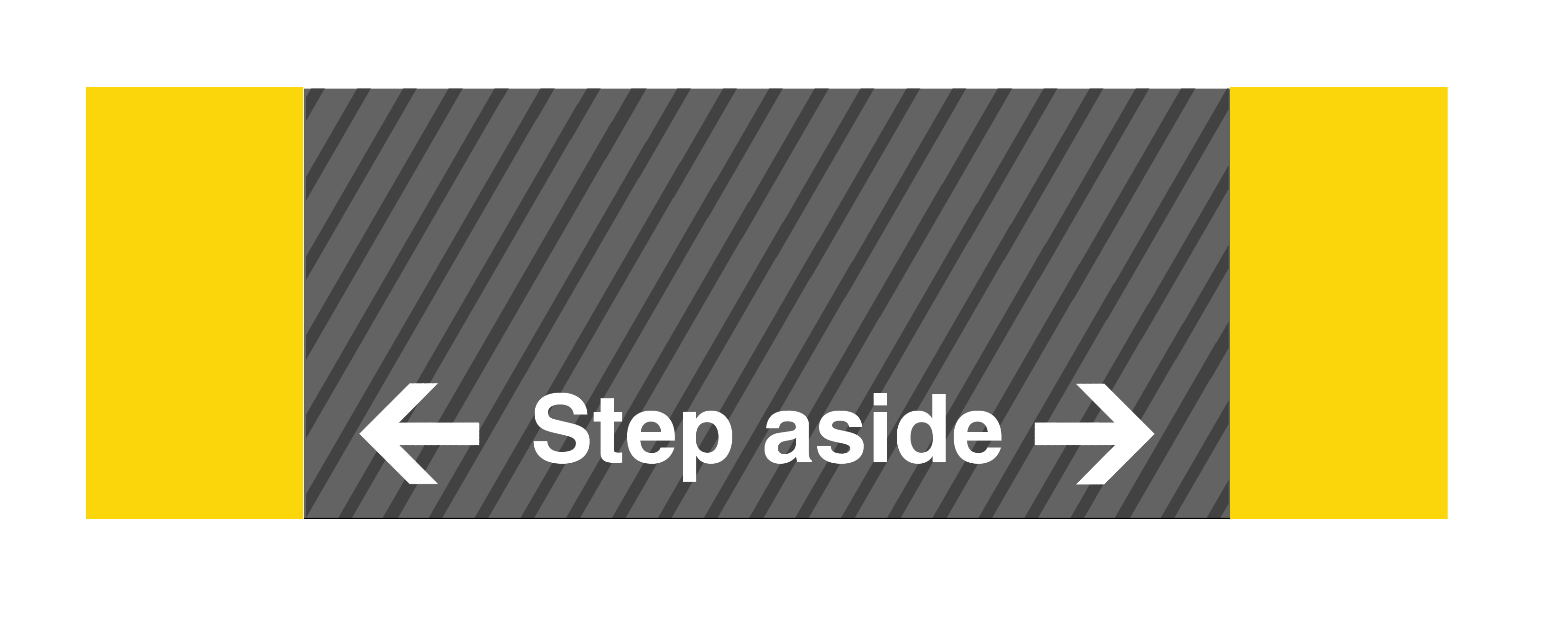
My version is pretty simple. The main change is that I am suggesting people walk into the brighter section instead of the black bars on the MTA version.
Luckily there is hope for NYC in some places. I live in Greenpoint, Brooklyn next to several signage studios that hand paint advertisements. This is certainly a lost art. I really enjoy watching them paint these murals and signs. It gives a brand / logo / idea a different quality. As someone who tries to ignore ads as much as possible by not owning a TV, hating the radio, putting three ad-blockers on all my web browsers – I find that I cant help myself but to look at and enjoy the work these studios do. They also often times help businesses in my community by paining murals on the weekend. Such as this one:
