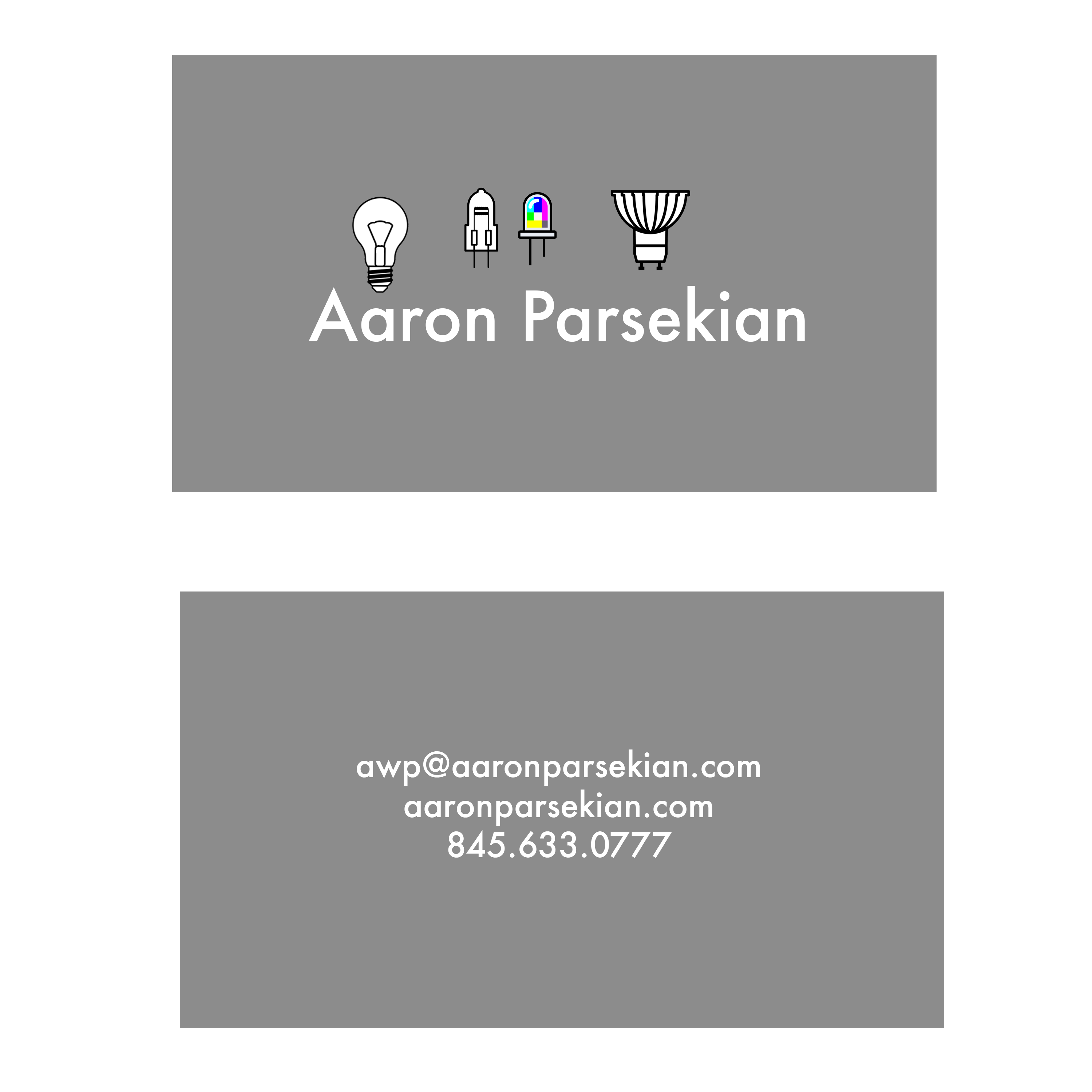
This week we designed business cards for ourselves. I decided early-on that I wanted to do something simple. Since our typography class I have taken a liking to Futura and how my name looks set in it.
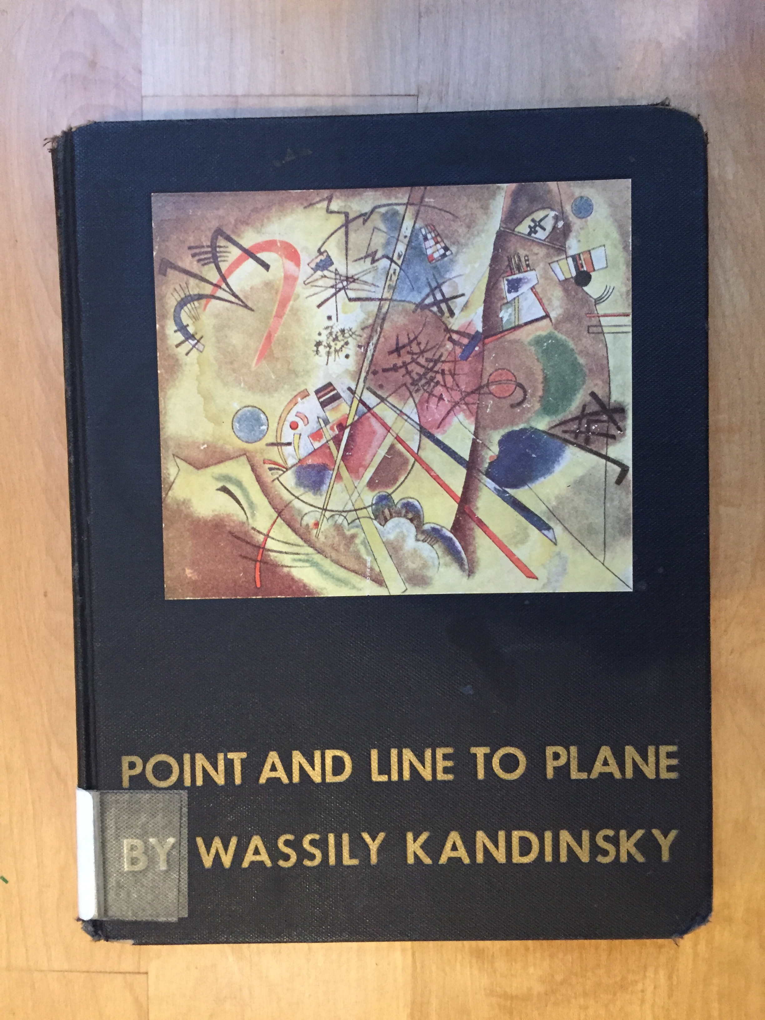
I also checked out Kandinsky’s book on composition. It was an interesting read, but some of it came off as drawing meaning out of thin-air. Mel Brooks comes to mind!
Back to the business card – I found myself working in circles quite a bit on this one. I decided to use my logo from the previous week, along with icons of light bulbs that I found on thenounproject.com which I then modified. The original icons were designed by Eli Ratus (https://thenounproject.com/mordarius/collection/light-bulb-socket-standards/)
I tried quite a few different designs!
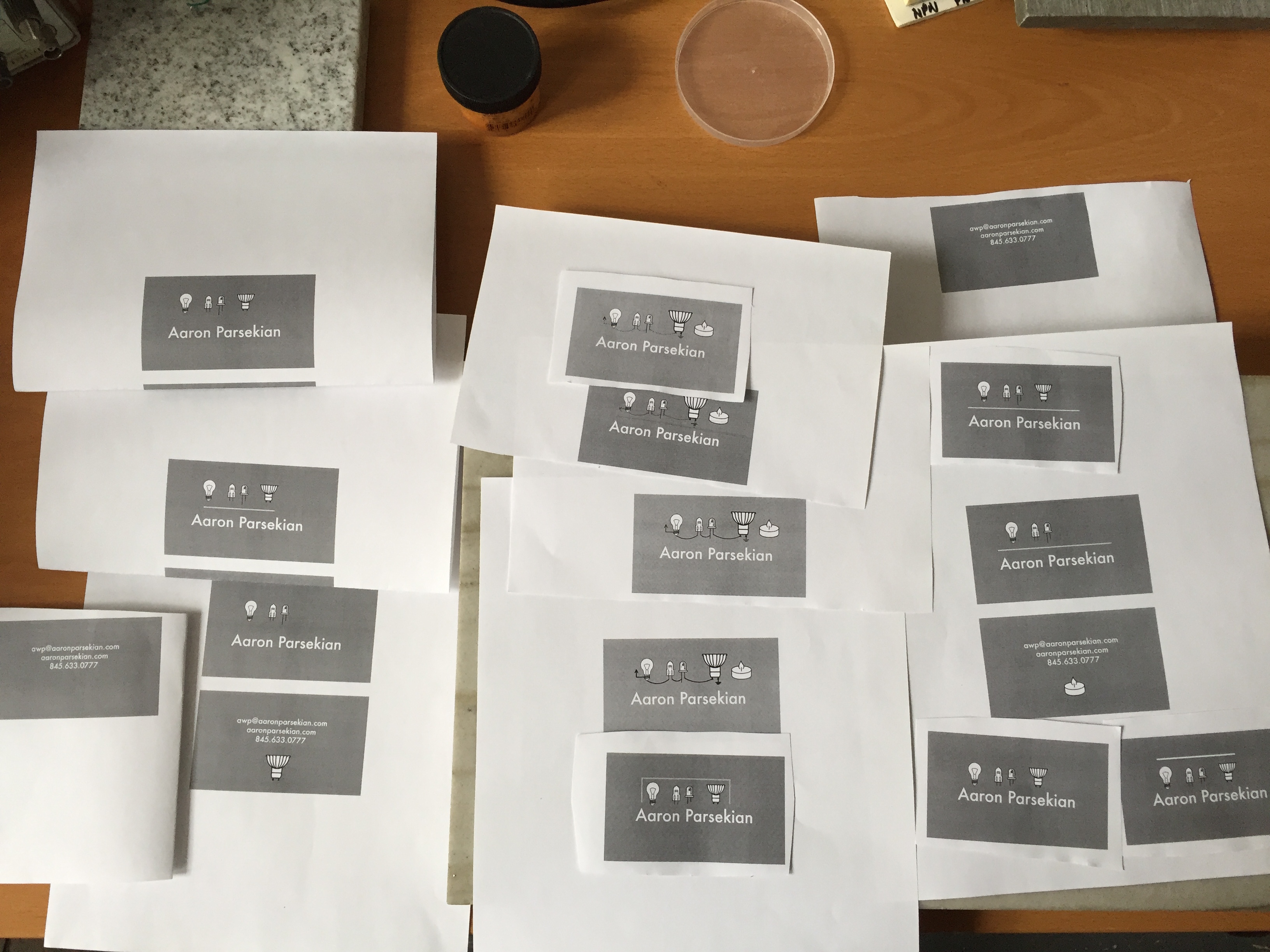
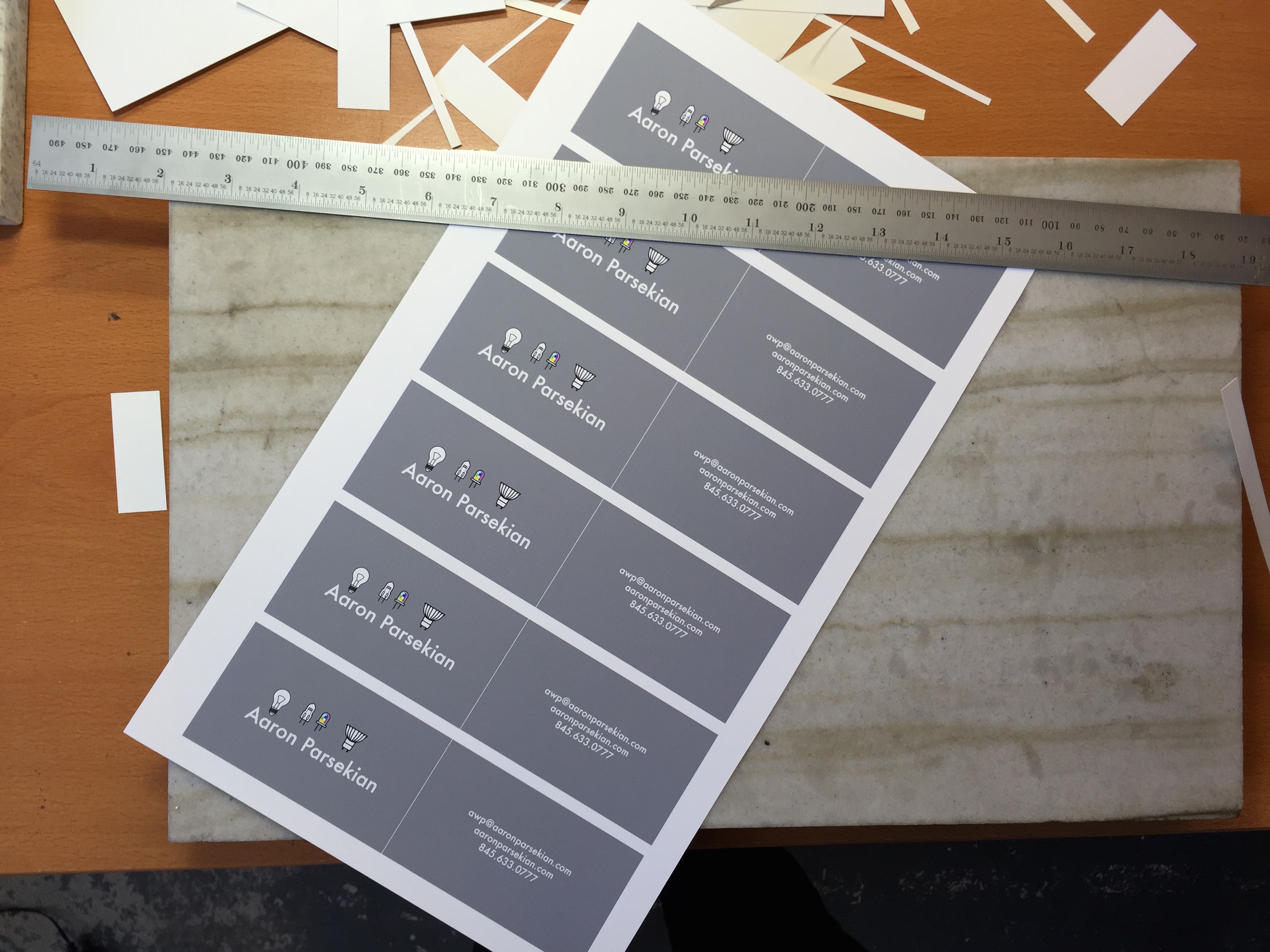
I ended up with inkjet prints on matte presentation paper that I cut out and folded in half.
Here is the finished product for now: