CYRK Poster
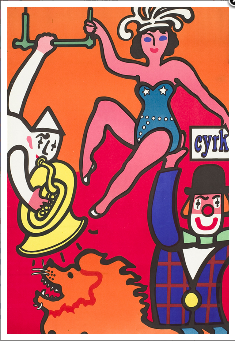
The design I chose was a poster made for the circus in Poland. Following WWII, the polish government wanted to revamp the image of the circus in a modern fashion, and show off the arts and culture that were government sponsored at the time. I like this poster because it is a lively expression of circus shown in bright colors and smiles. It can be identified quickly from afar, and Im sure its colorful spirit was helpful on fences covering buildings damaged during the war.
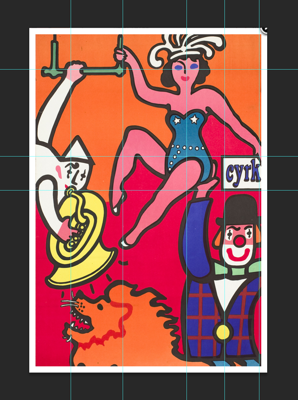
Here I have outlined some of the underlining composition. The form of the performers arms, legs, and faces fit these guides very well.
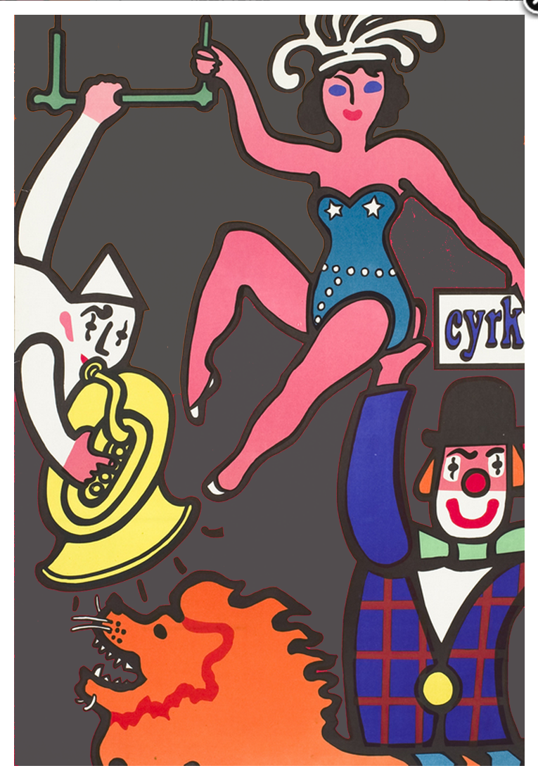
In this copy I have substituted the negative space with neutral grey. The cut-out style of the illustration makes for heavy contrast between the negative space and the other elements of the poster.
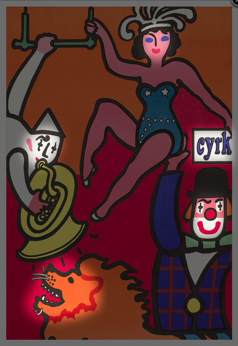
To me the hierarchy in this work begins with the smiling expressions of the performers, followed by the ‘Cyrk’ text (circus in Polish).
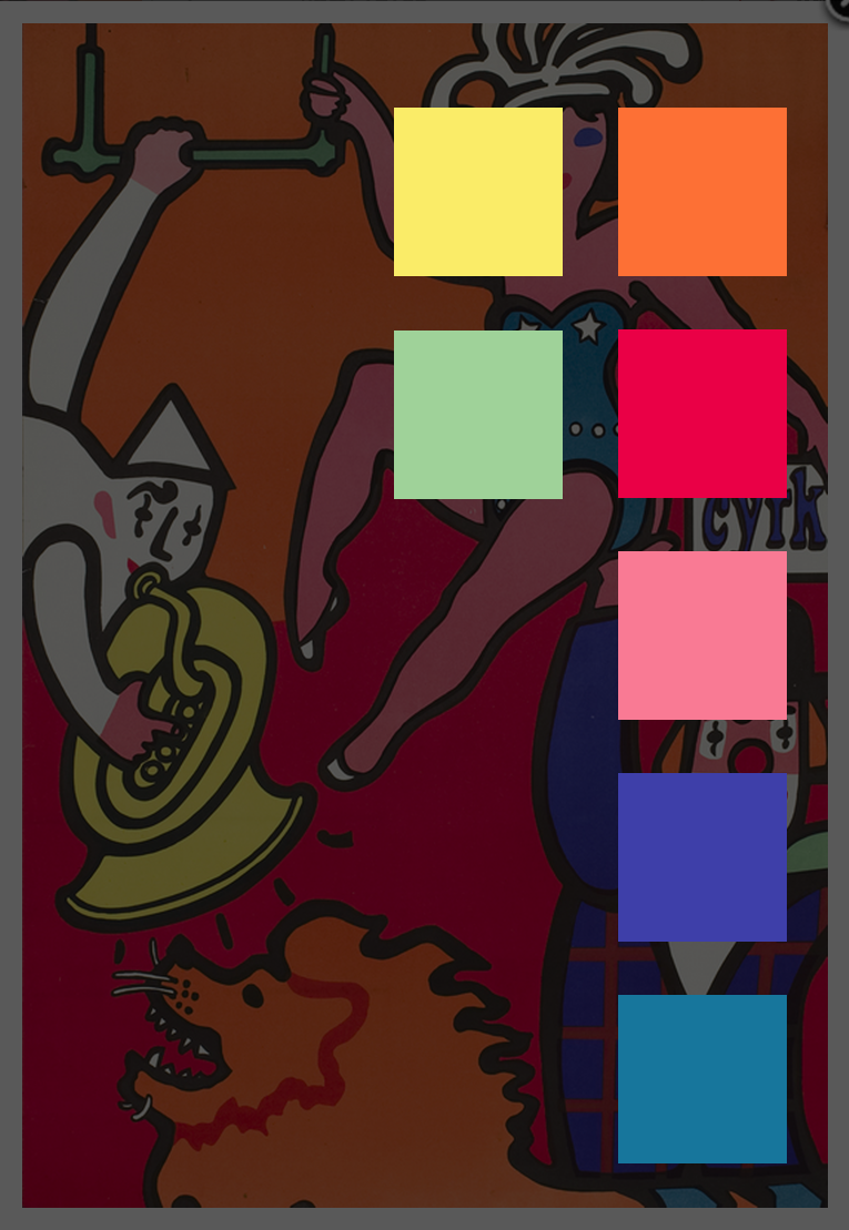
The seven vibrant colors used are a great representation of the subject matter, and successfully draw the viewer into a fun scene from afar.
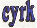
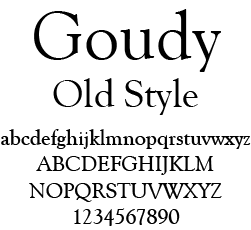
Finally, the single font used in this poster is a tough one to pinpoint. It has been heavily compressed and manipulated. I believe it is routed in Goudy Old Style, a serif typeface.