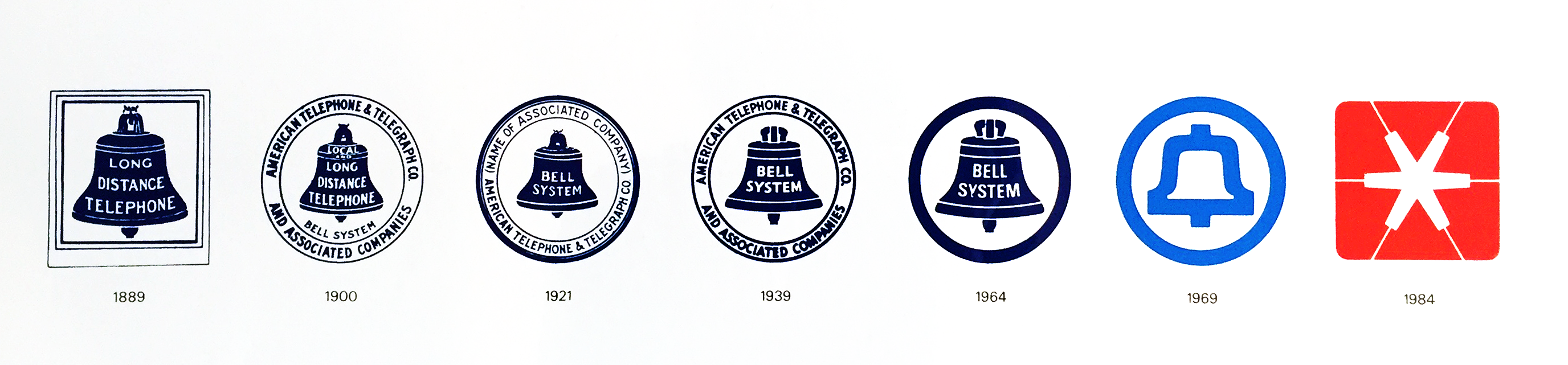
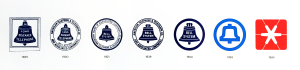
This week we learned about logo design. We started this assignment by identifying a logo that we feel is successful. I chose Saul Bass’s logo for Bell Telephone. For many years I’ve enjoyed this logo. I think its simplicity is timeless. In fact it has outlived the company it was designed for. Here is a lineage of Bell Telephone’s logos, with Saul Bass’s version second from the right:
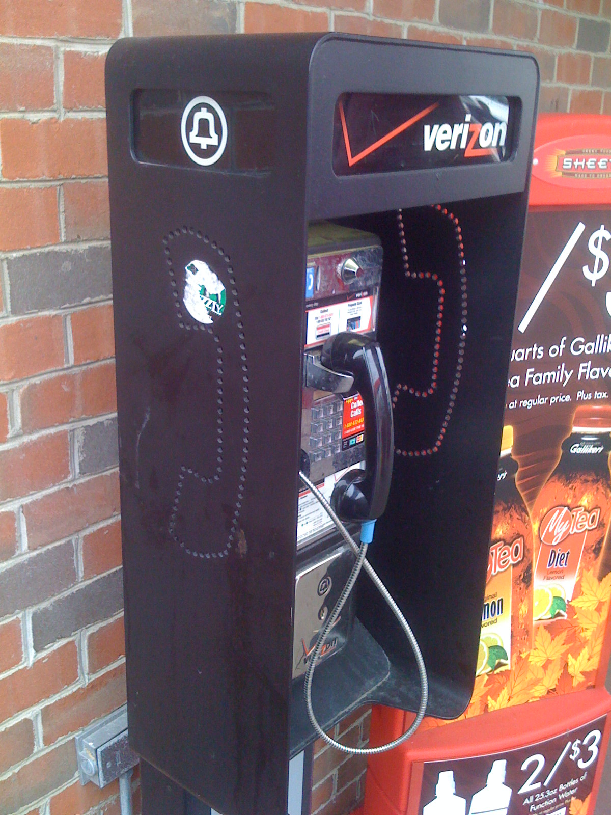
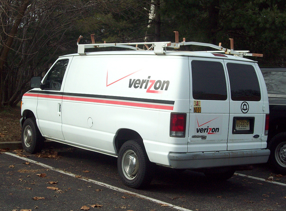
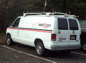
Even though AT&T bell telephone was broken up in 1984, Saul’s logo lives on! Hidden on verizon equipment you can still find it. Verizon employees still hold their allegiance to Ma Bell.

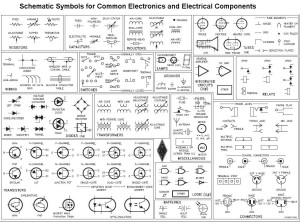
Visually I think this logo is very successful. It takes Alexander Graham Bell’s surname, tied with a functional bell, and yet gives it a cutting-edge simplicity that to me relates it to electronic schematic:
I also find the light blue Saul chose to be very eye-catching.

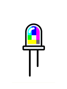
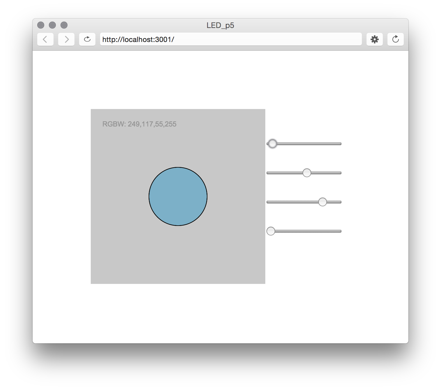
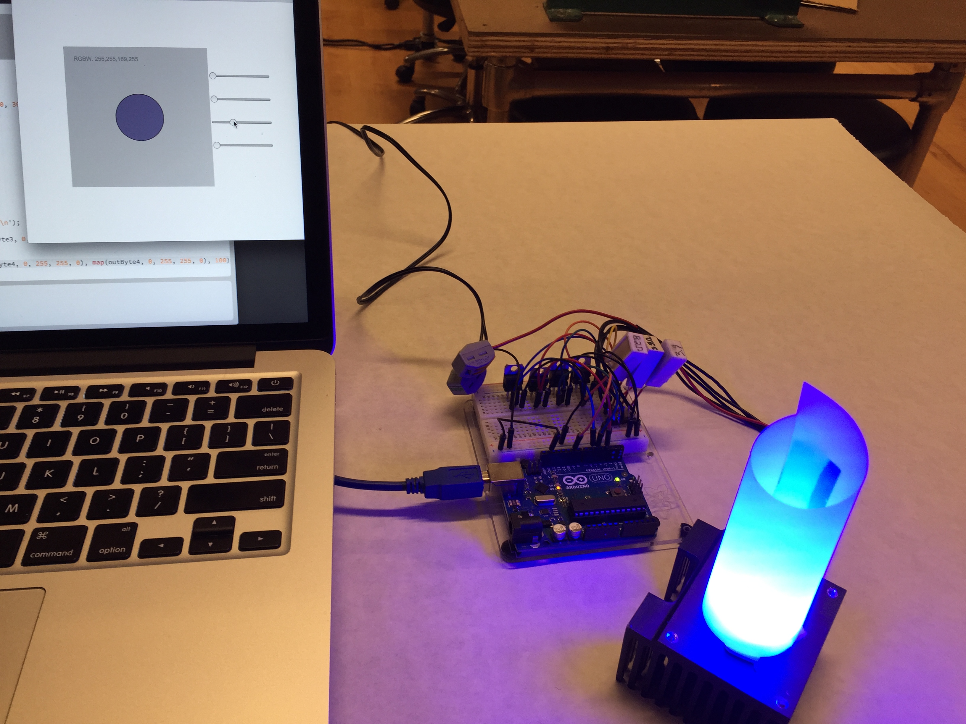
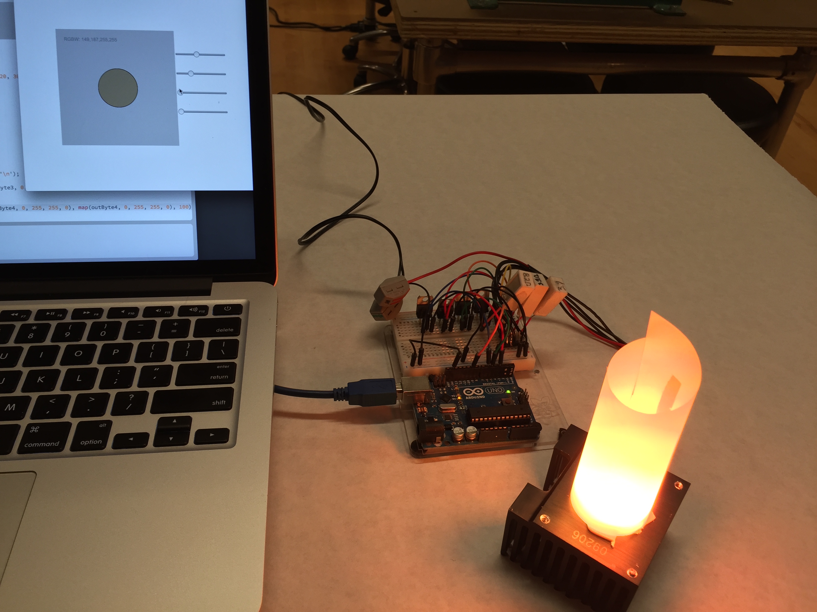
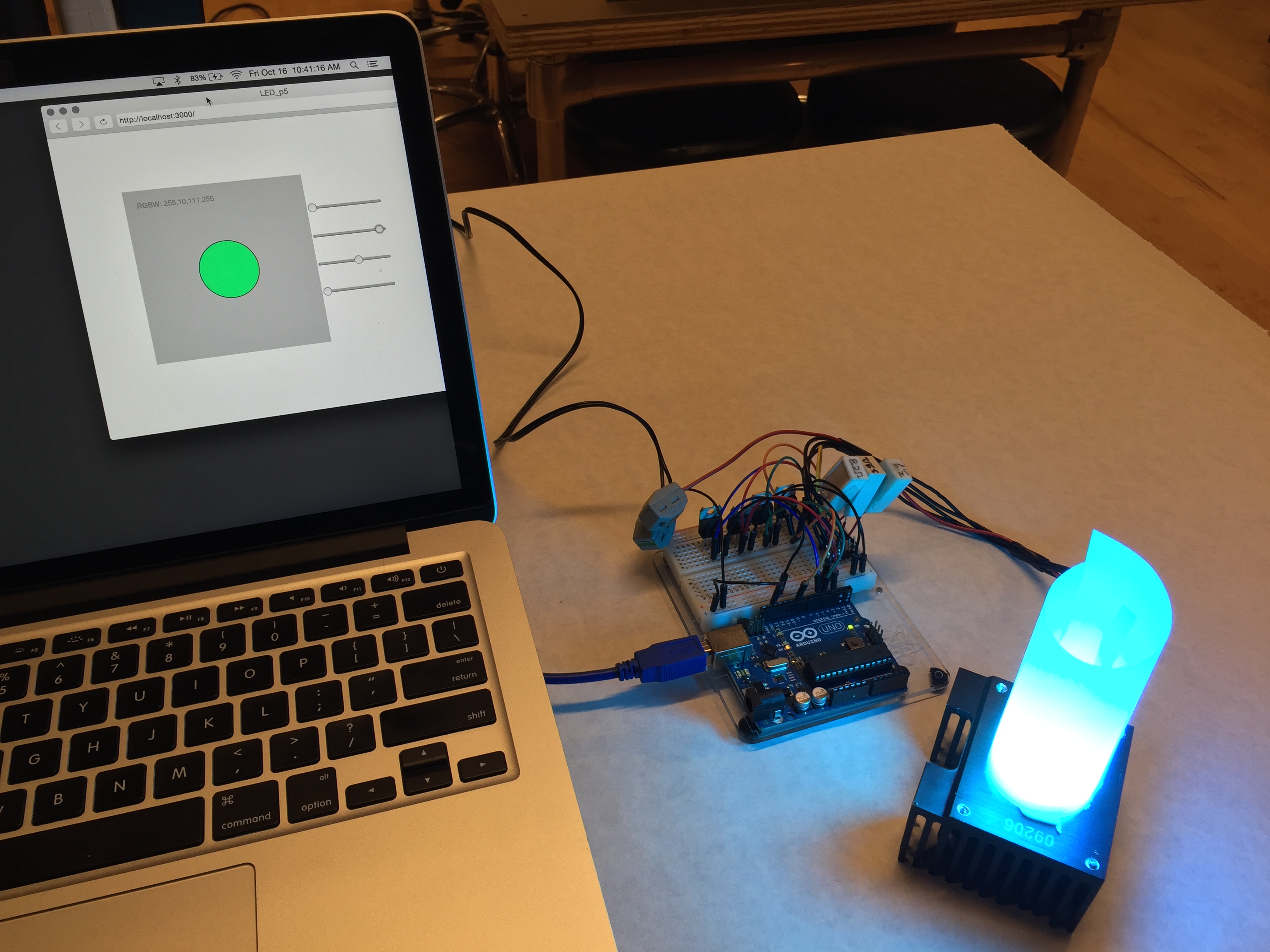
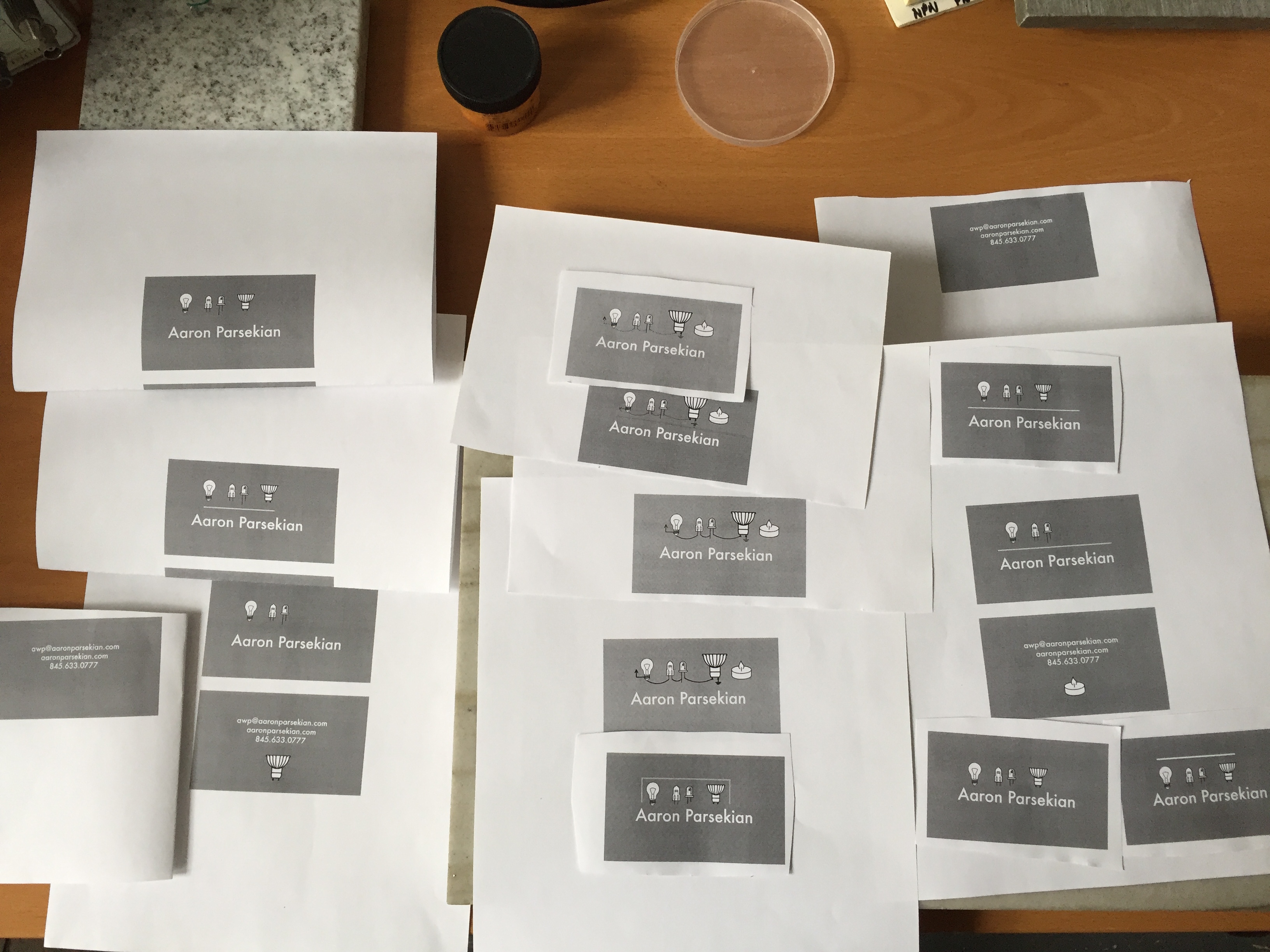
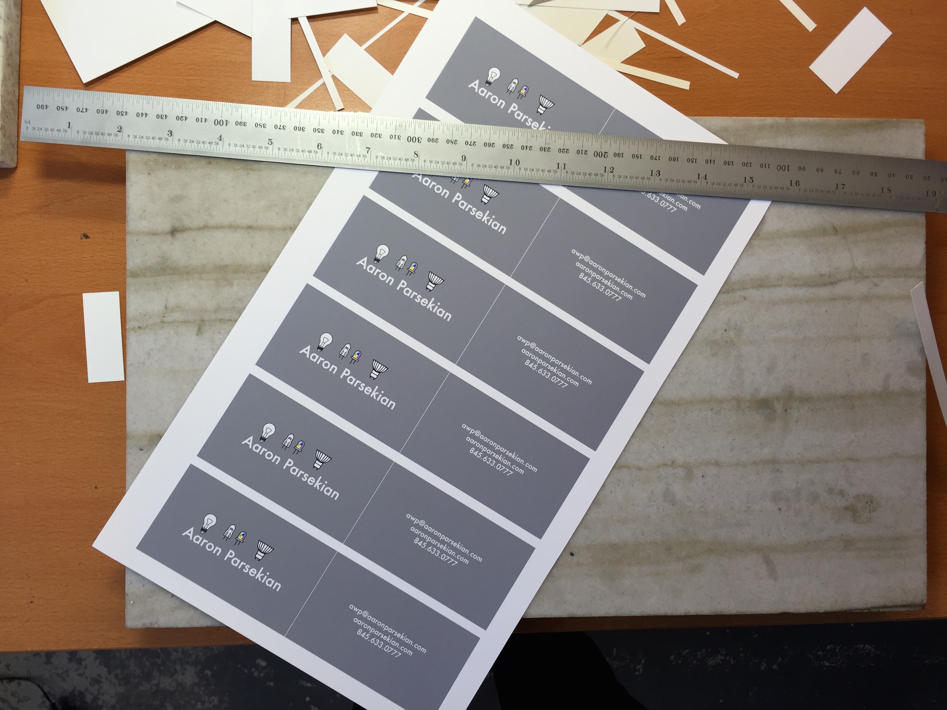
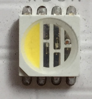
We also designed a logo for ourselves. Early on I experimented with electrical schematic symbols, lighting drafting symbols – things which describe me and my work. I decided that an LED would be a good start. I wanted to use a square RGB LED, as I use these quite often at work – but I didn’t find them to be legible enough to get the point across to laymen.

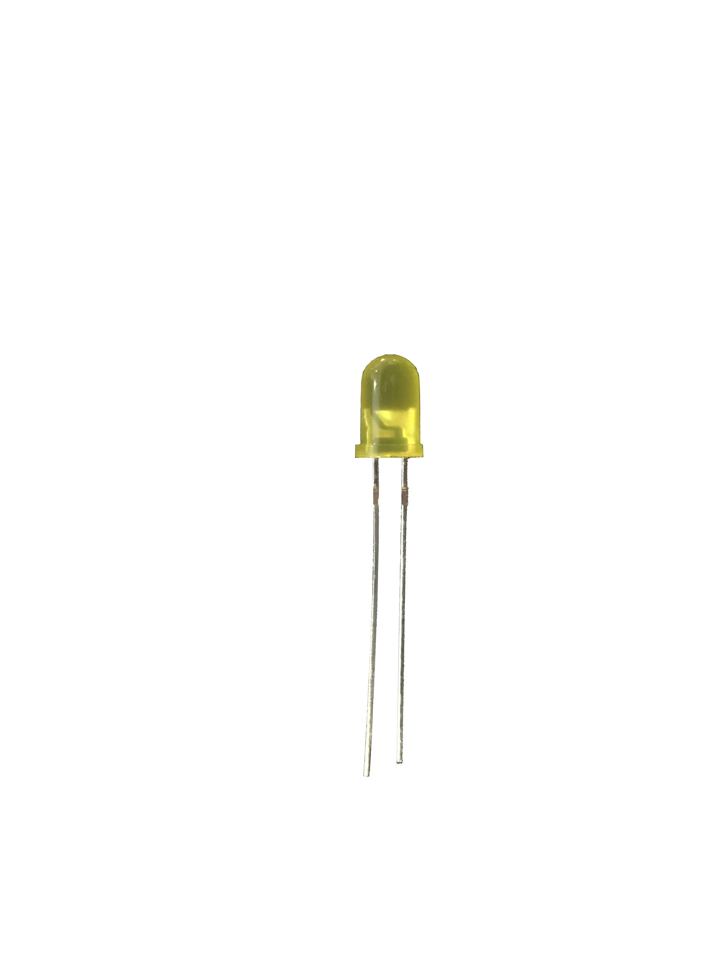
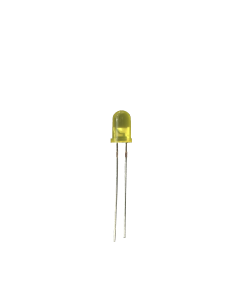
I then moved to the more classic LED. I think it is more identifiable:
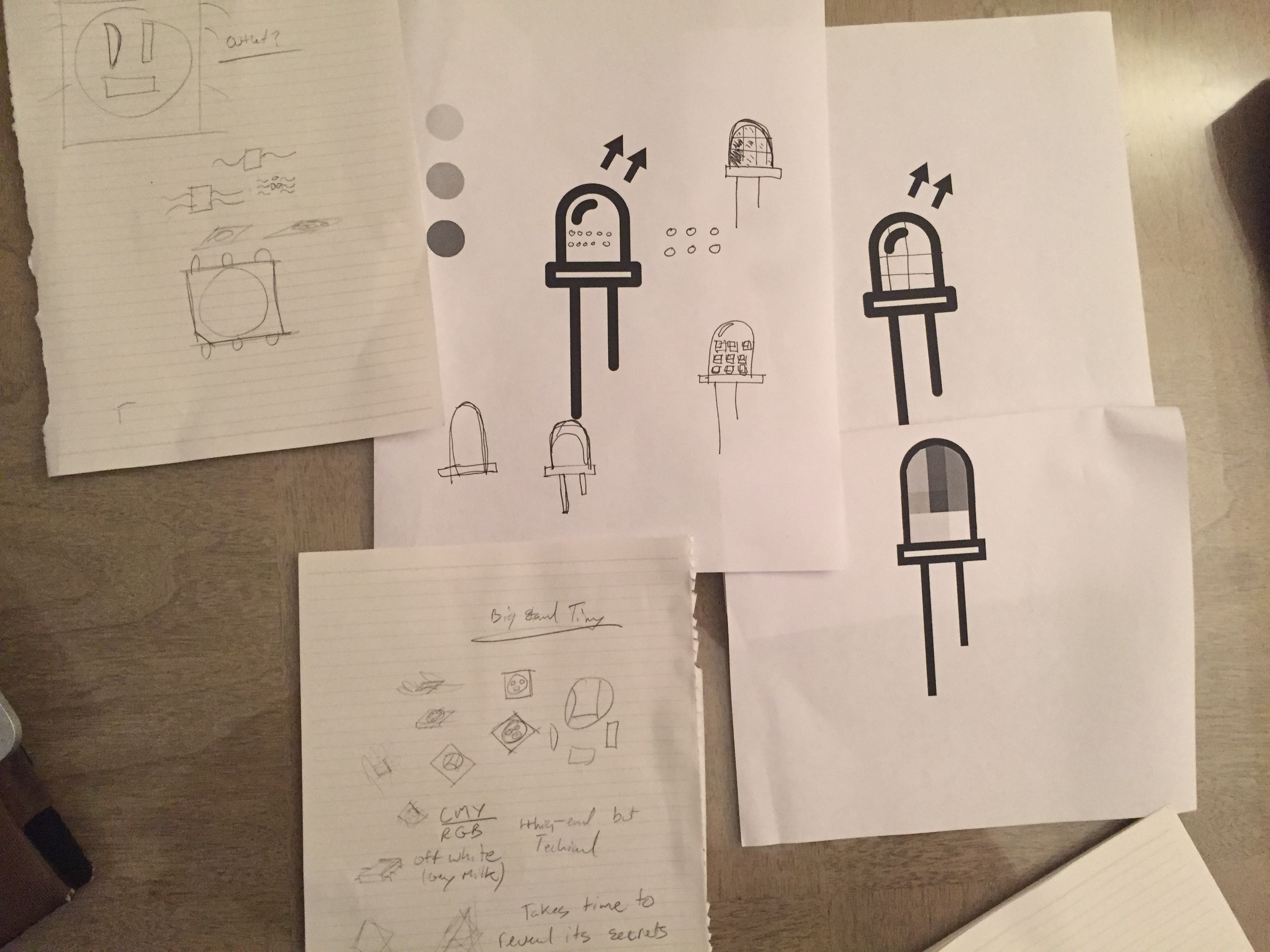
I started sketching with both:

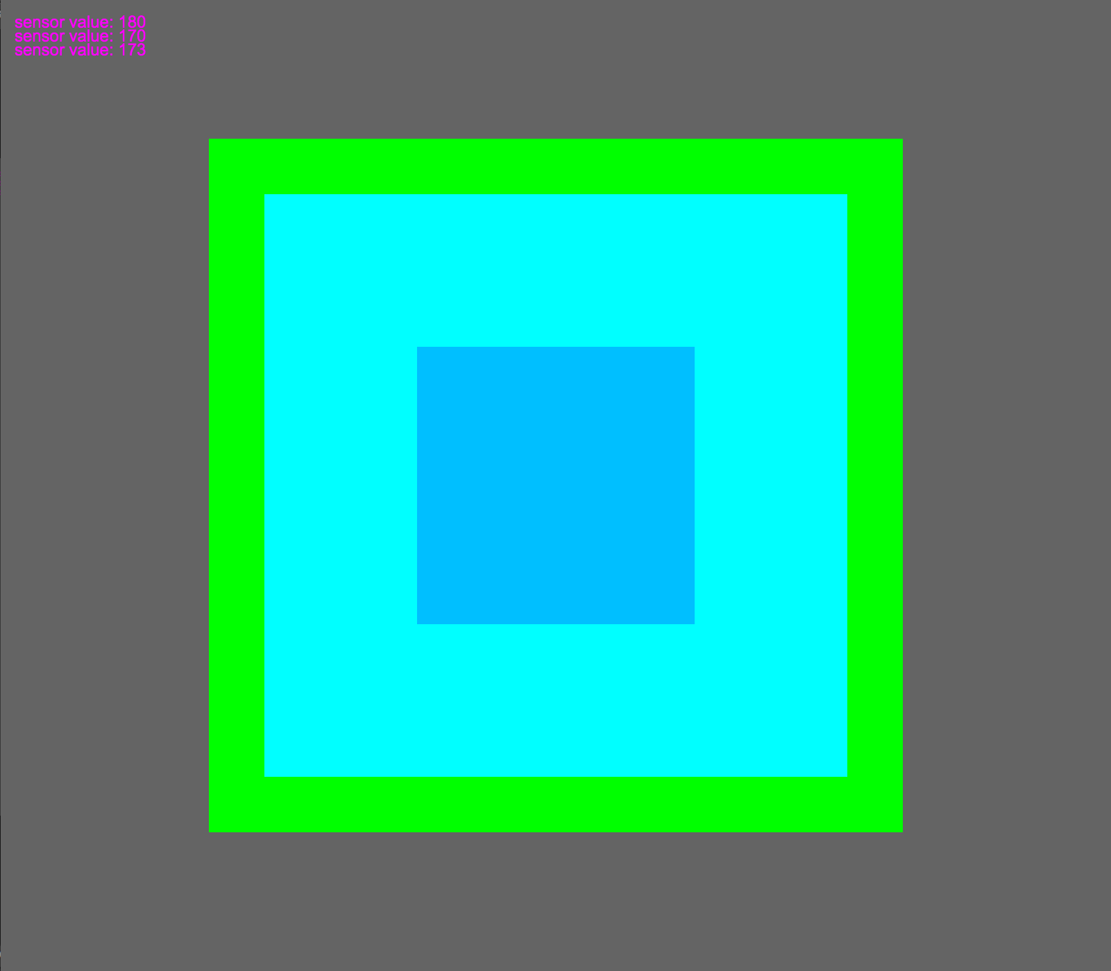
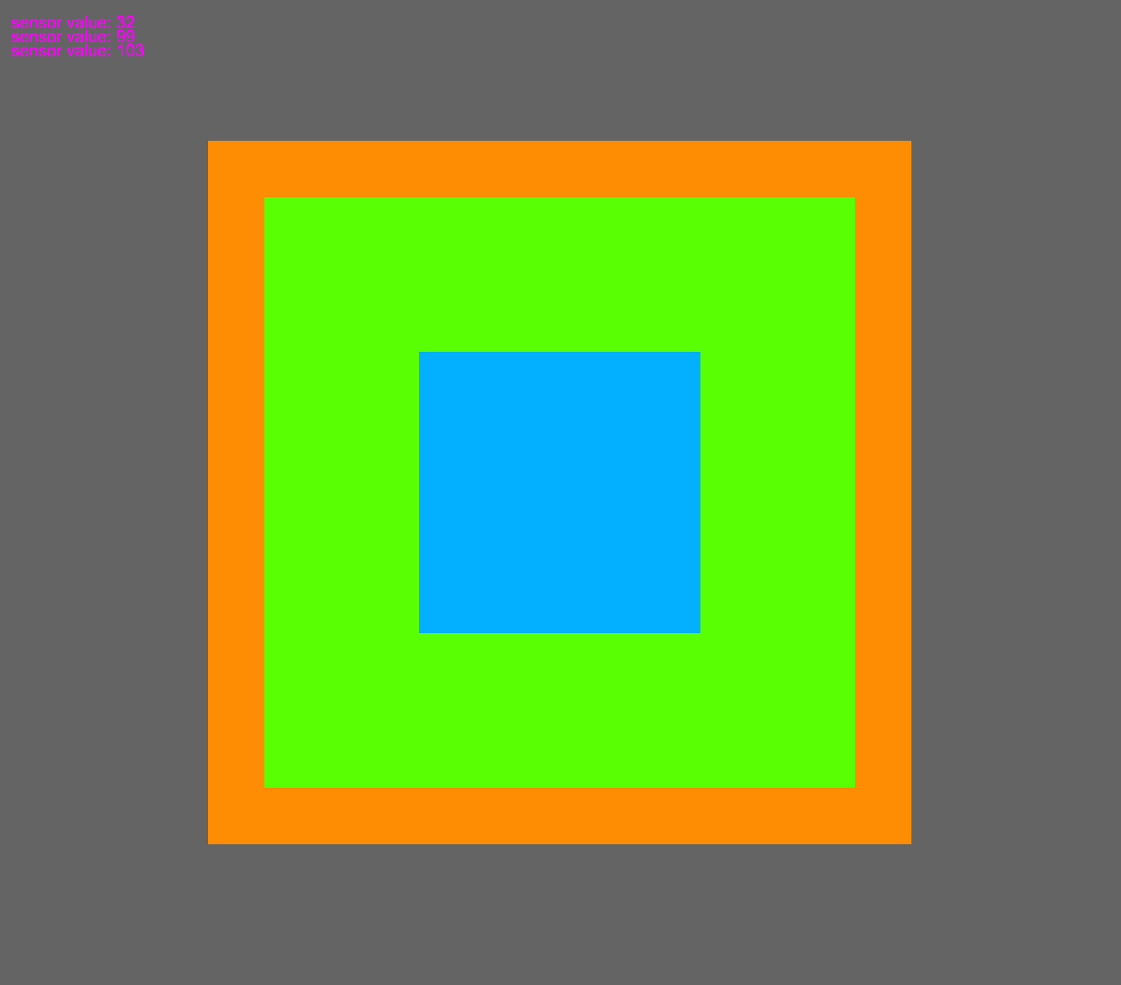
I wanted to use some color, as a lot of my LED work involves color. Almost all of the time LED color is described as RGB, so I wanted to add on this by using CMY as well.

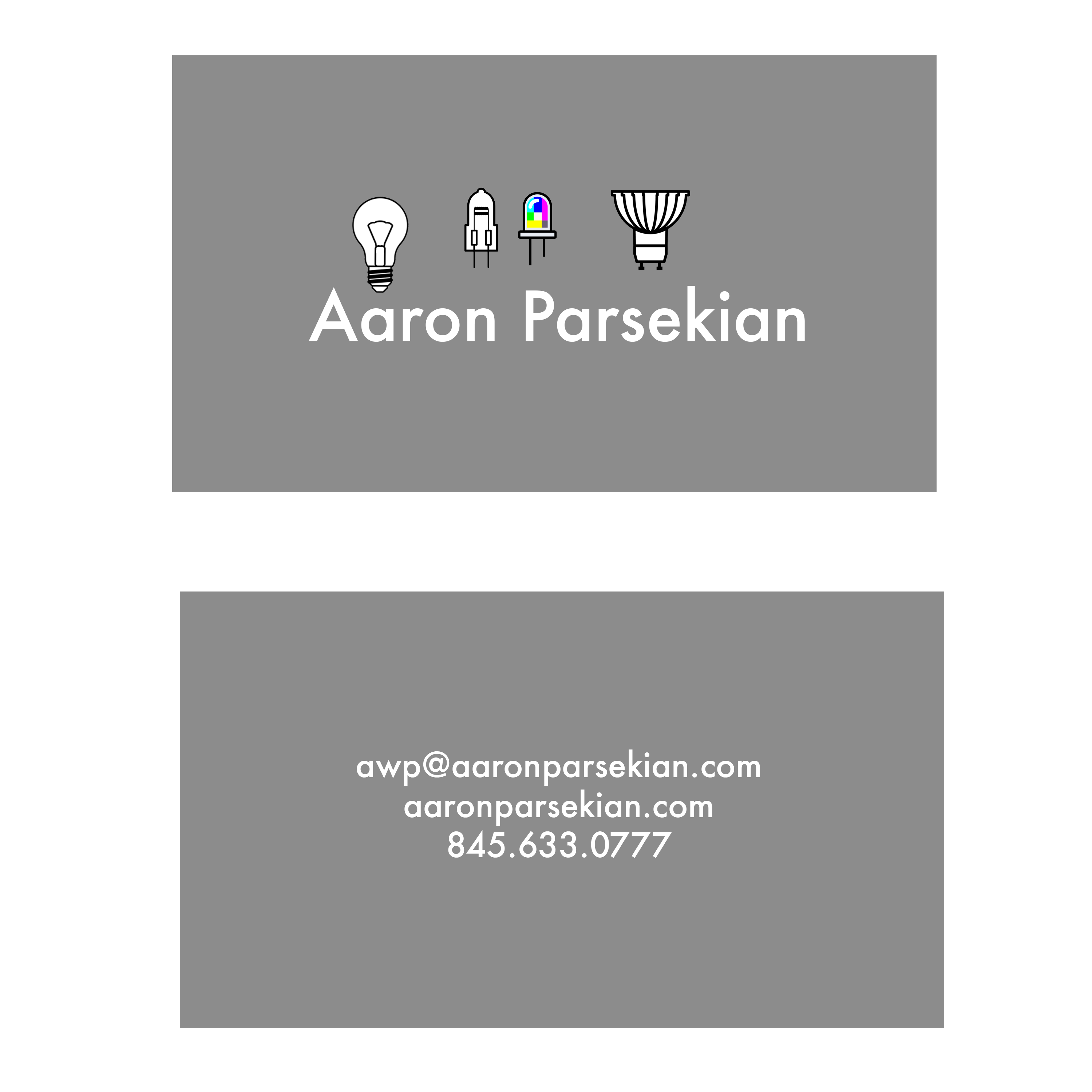
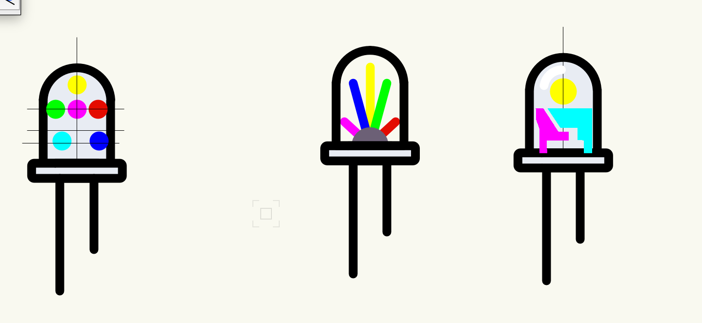
My “final” logo is below. I would really like to spend a lot more time on it, but I think it is a good start! I don’t know if Saul Bass would approve. . .