3rd Assignment – Digital and Analog Labs

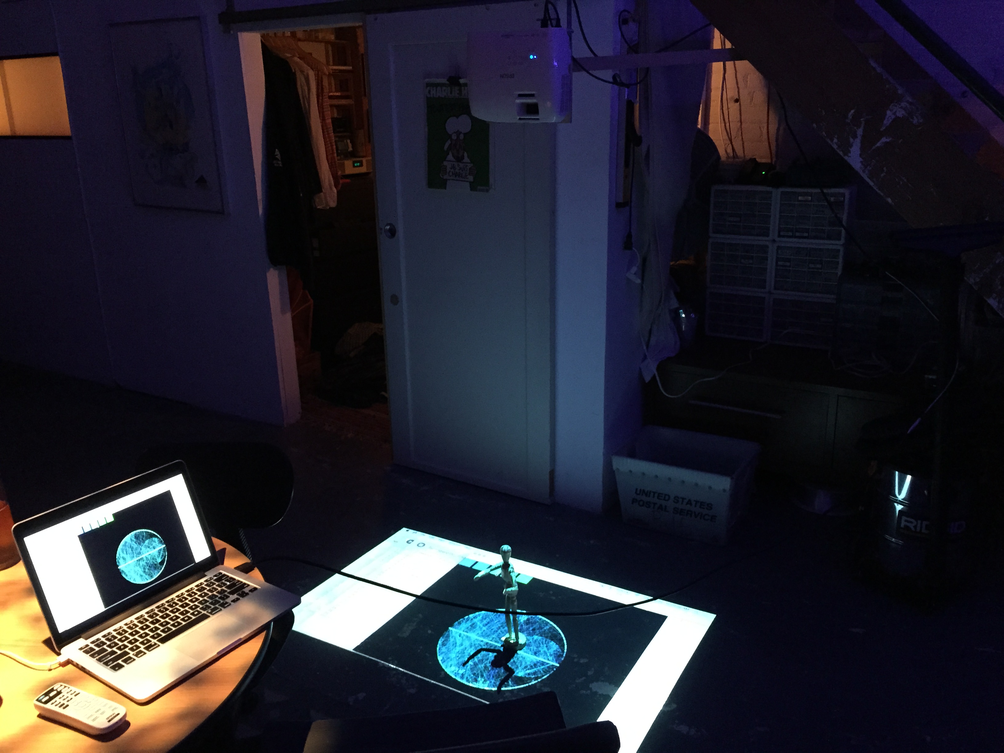
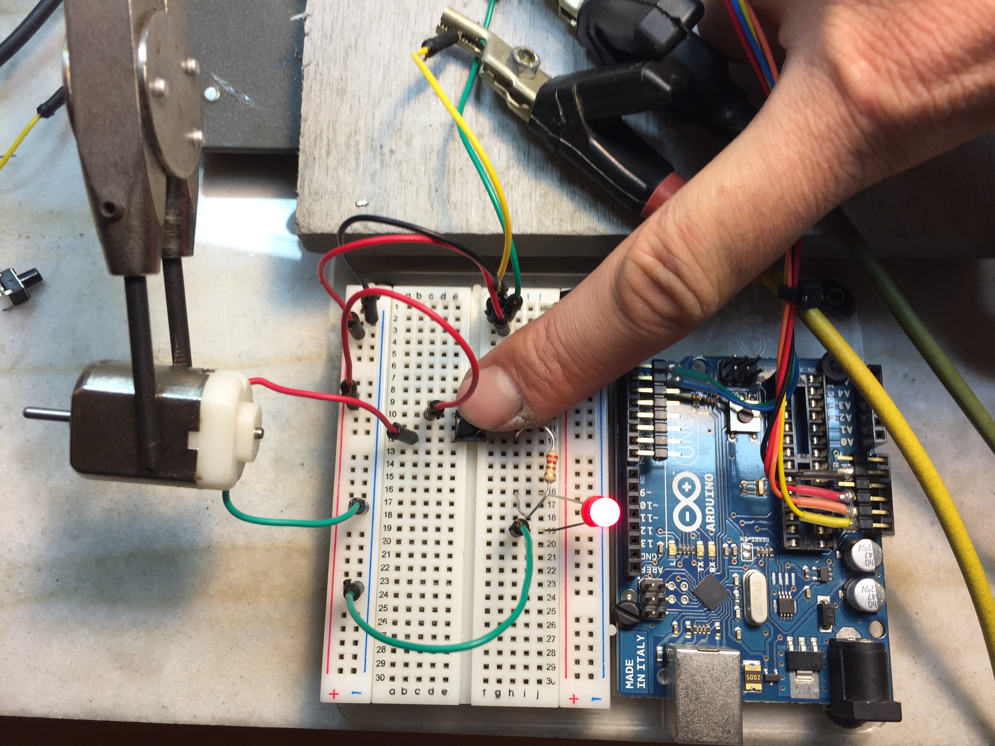
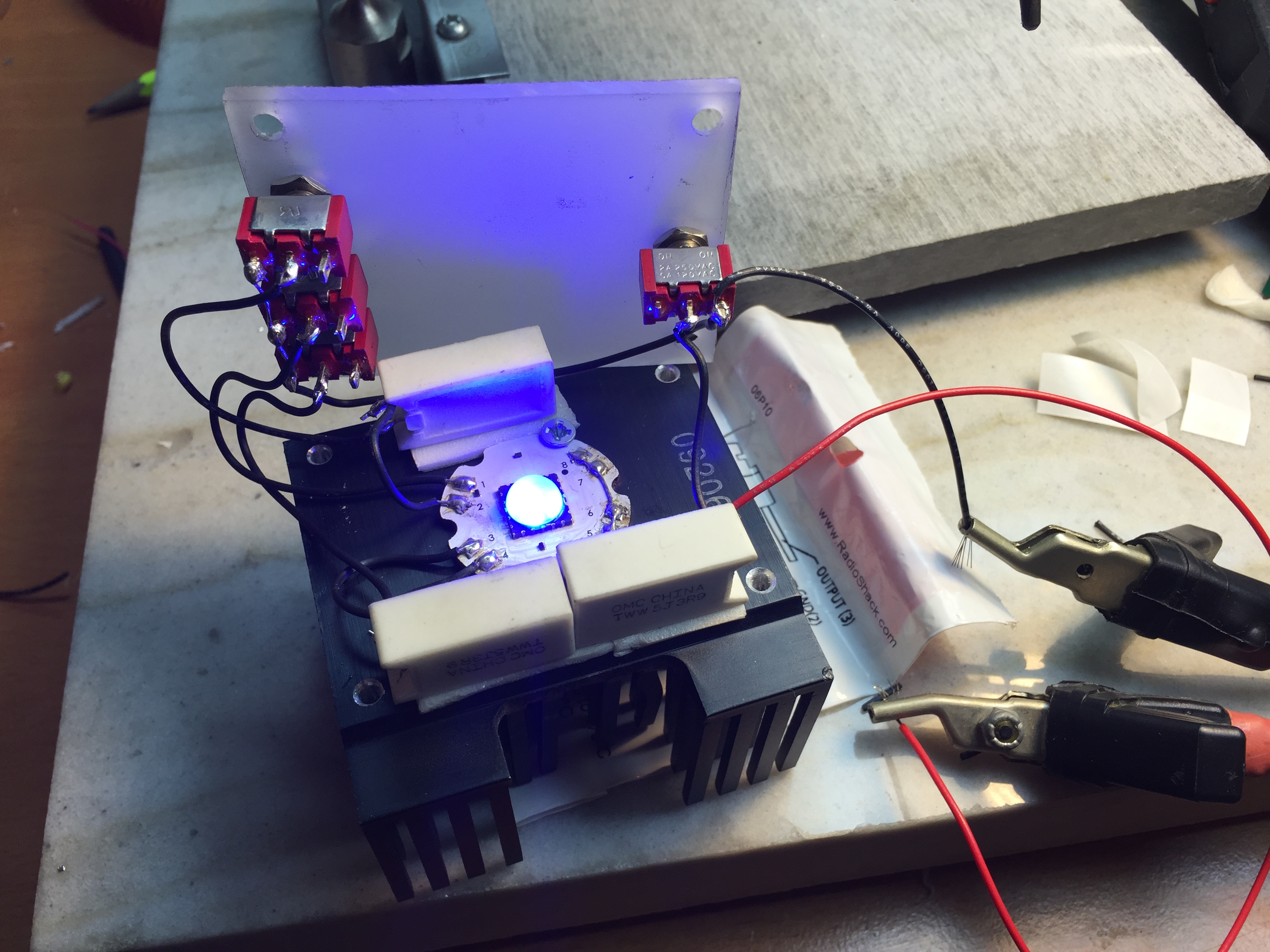
This week we started to use the Arduino to input and output analog signals.

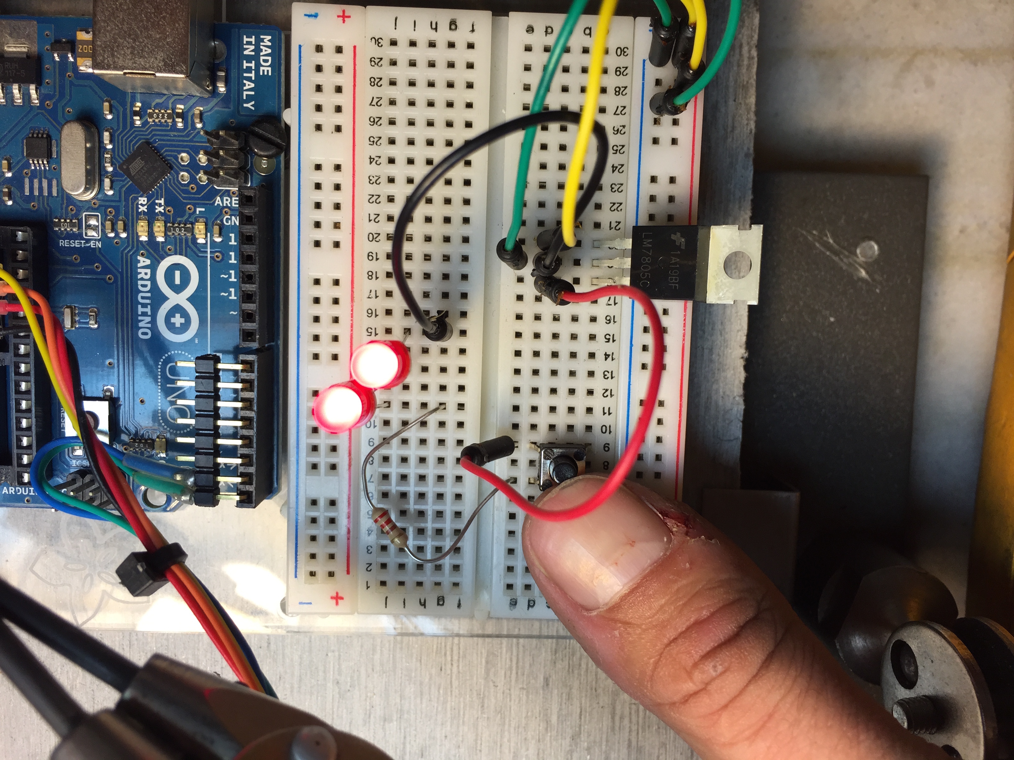
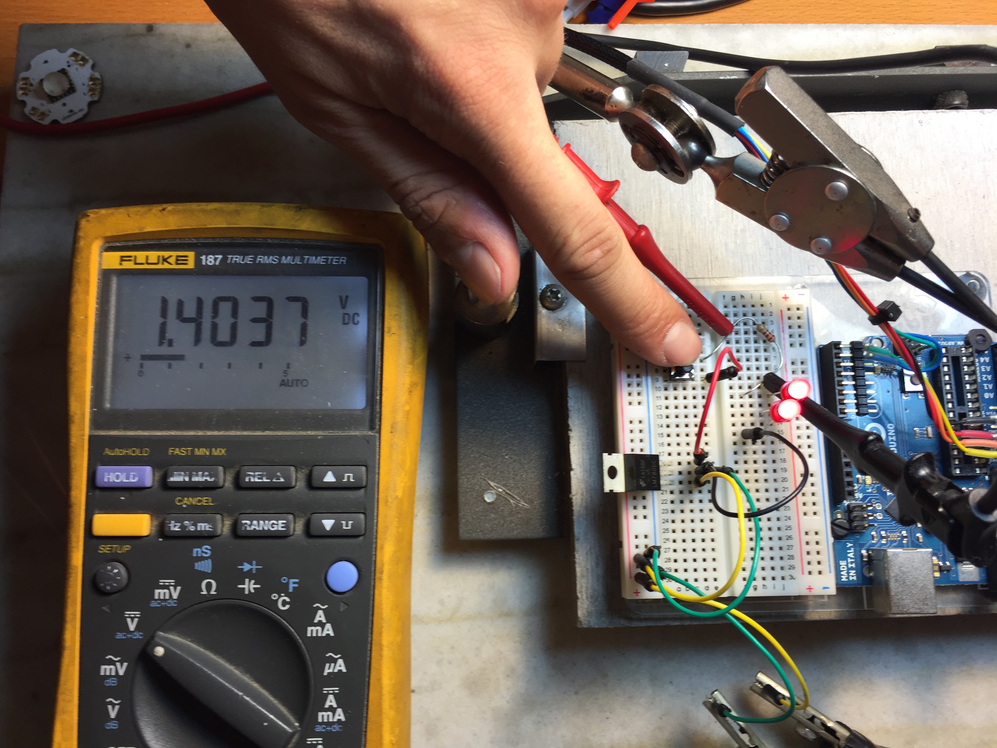
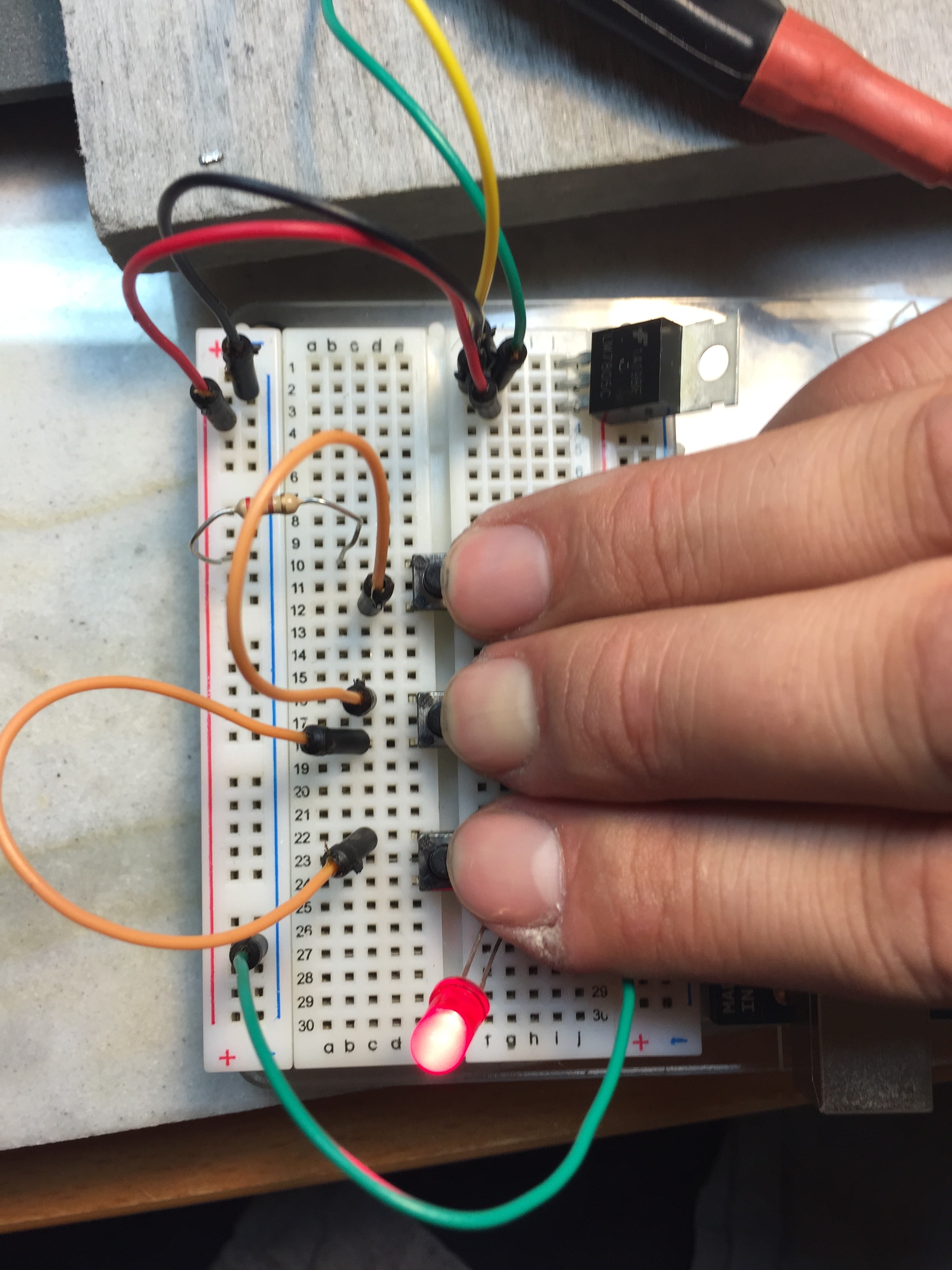
Beginning with a simple pushbutton to turn on an LED:
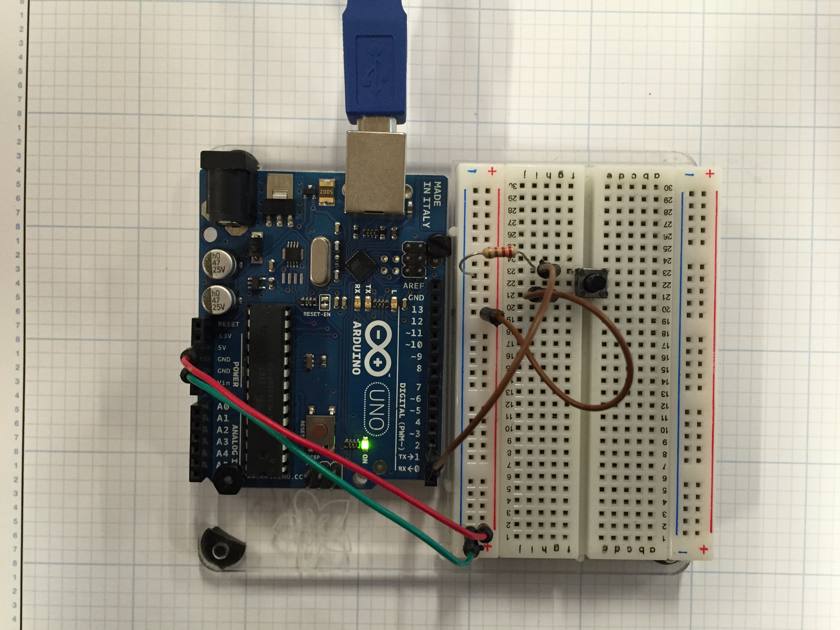
button_pin2

void setup() {
pinMode(2, INPUT); // set the switch pin to be an input
pinMode(3, OUTPUT); // set the yellow LED pin to be an output
pinMode(4, OUTPUT); // set the red LED pin to be an output
}
void loop() {
// read the switch input:
if (digitalRead(2) == HIGH) {
// if the switch is closed:
digitalWrite(3, HIGH); // turn on the yellow LED
digitalWrite(4, LOW); // turn off the red LED
}
else {
// if the switch is open:
digitalWrite(3, LOW); // turn off the yellow LED
digitalWrite(4, HIGH); // turn on the red LED
}
}

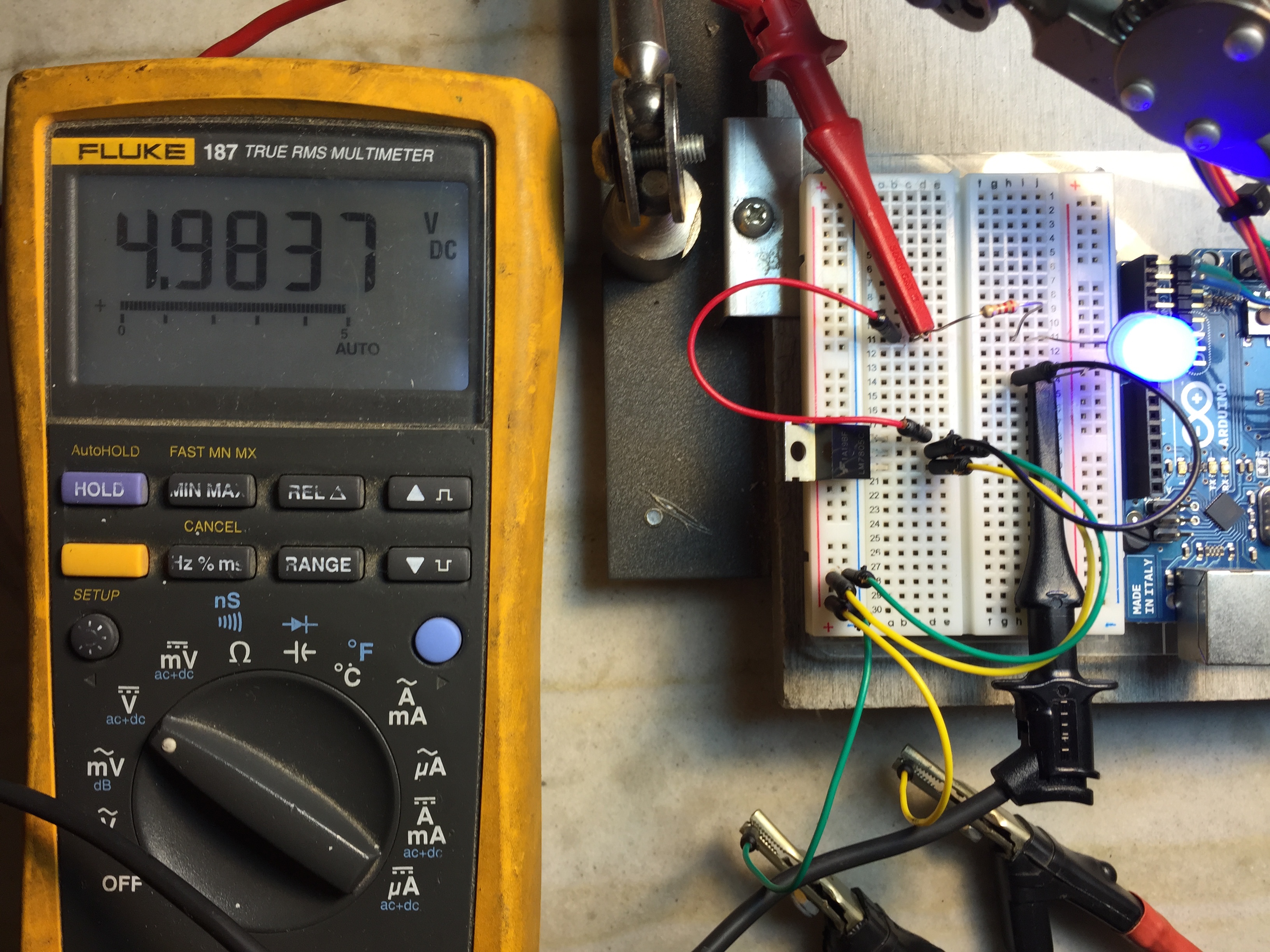
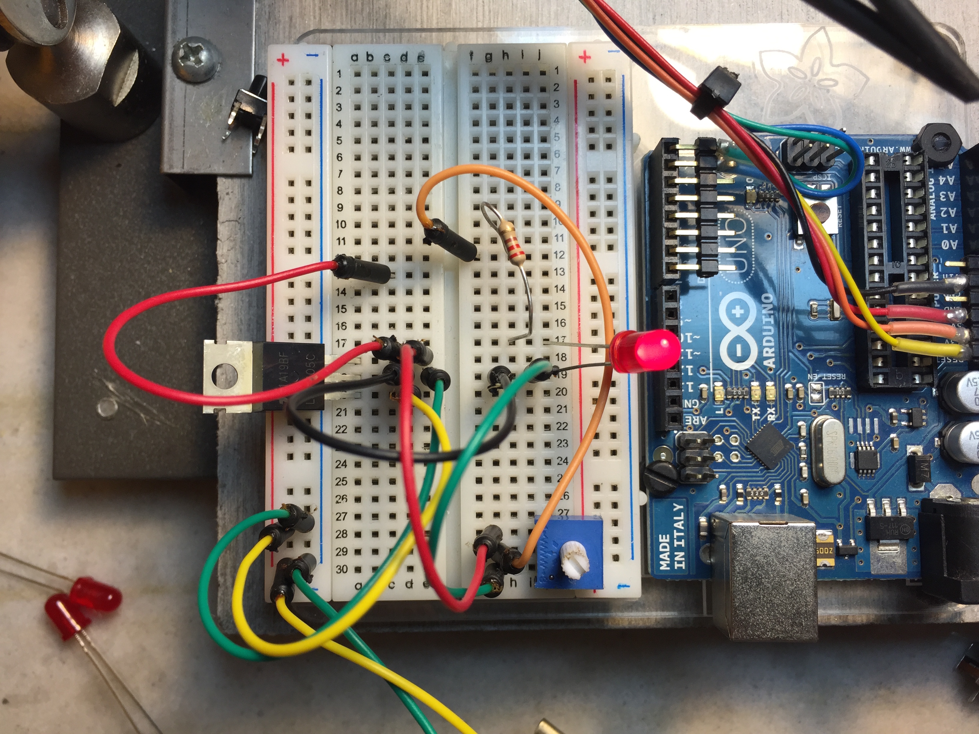
Next we worked with analog inputs:


const int ledPin = 9; // pin that the LED is attached to
int analogValue = 0; // value read from the pot
int brightness = 0; // PWM pin that the LED is on.
void setup() {
// initialize serial communications at 9600 bps:
Serial.begin(9600);
// declare the led pin as an output:
pinMode(ledPin, OUTPUT);
}
void loop() {
analogValue = analogRead(A0); // read the pot value
brightness = analogValue /4; //divide by 4 to fit in a byte
analogWrite(ledPin, brightness); // PWM the LED with the brightness value
Serial.println(brightness); // print the brightness value back to the serial monitor
}

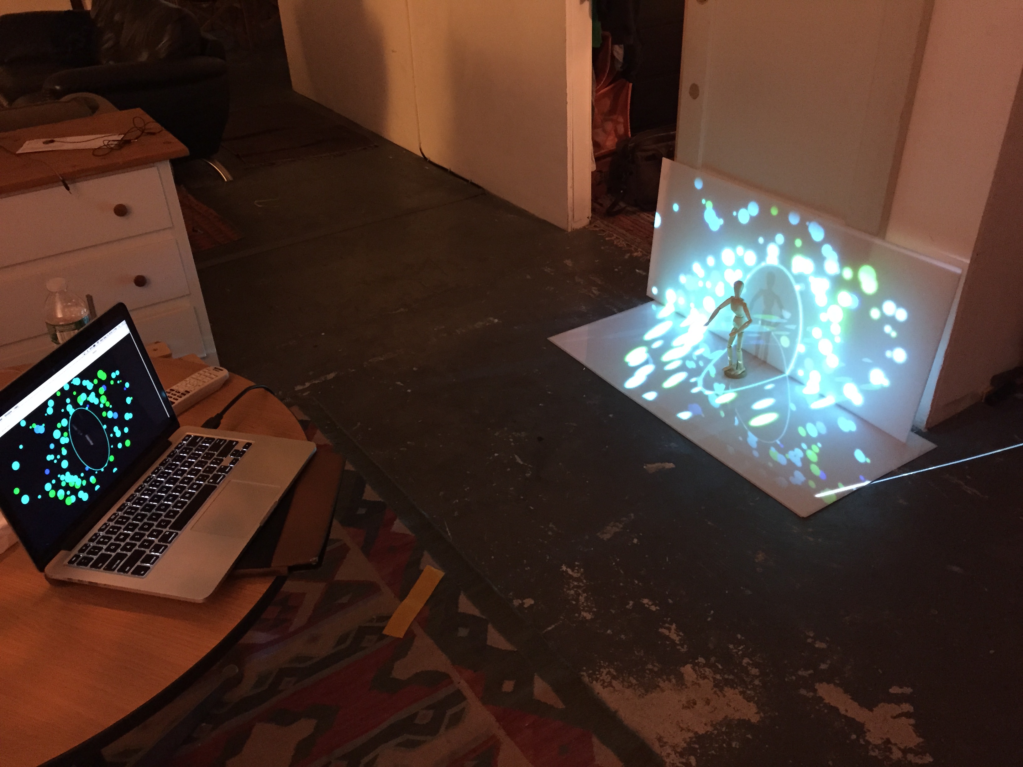
Here is the code outputting to a potentiometer:

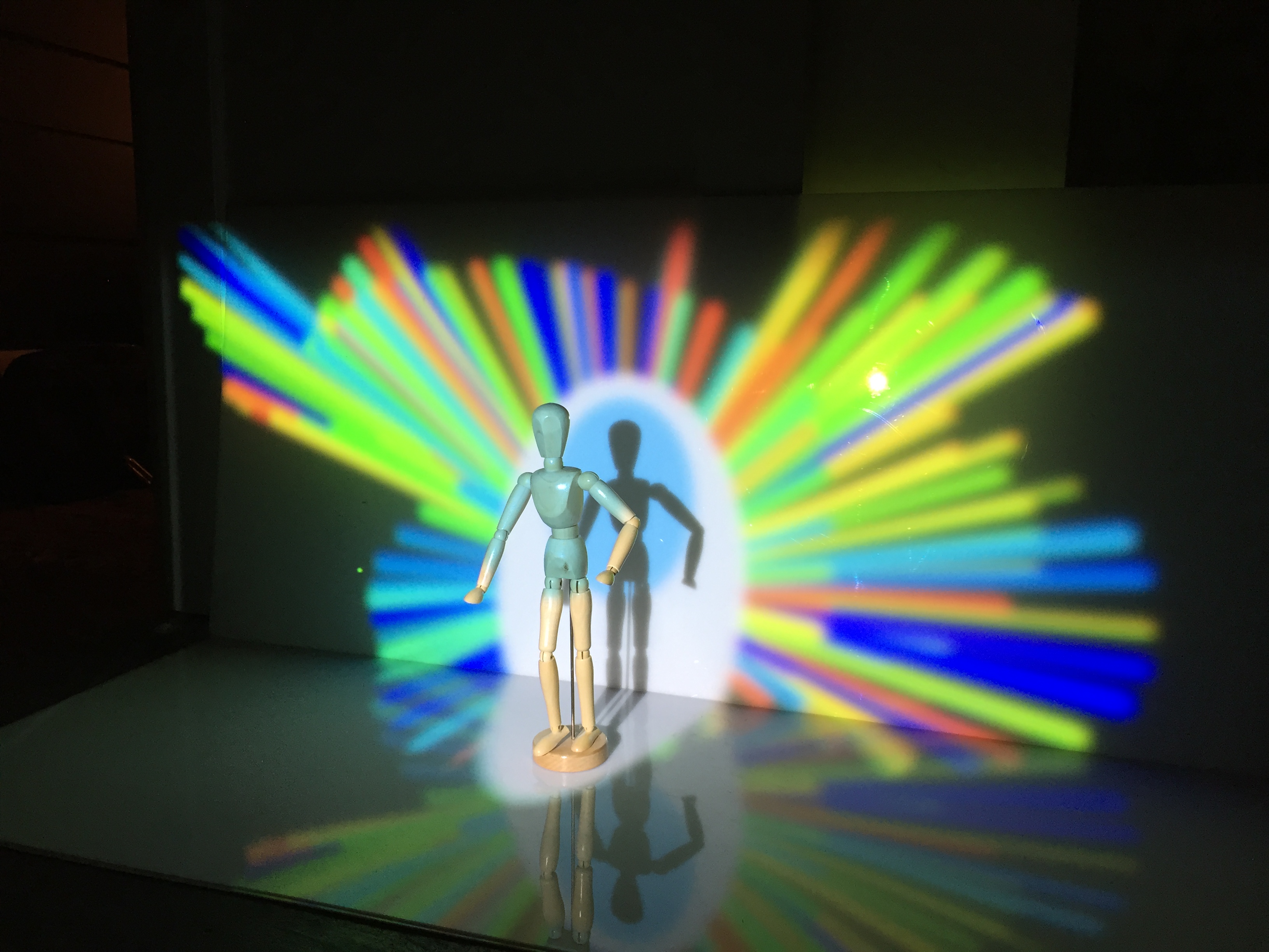
And here it is with a CdS Photoresistor:


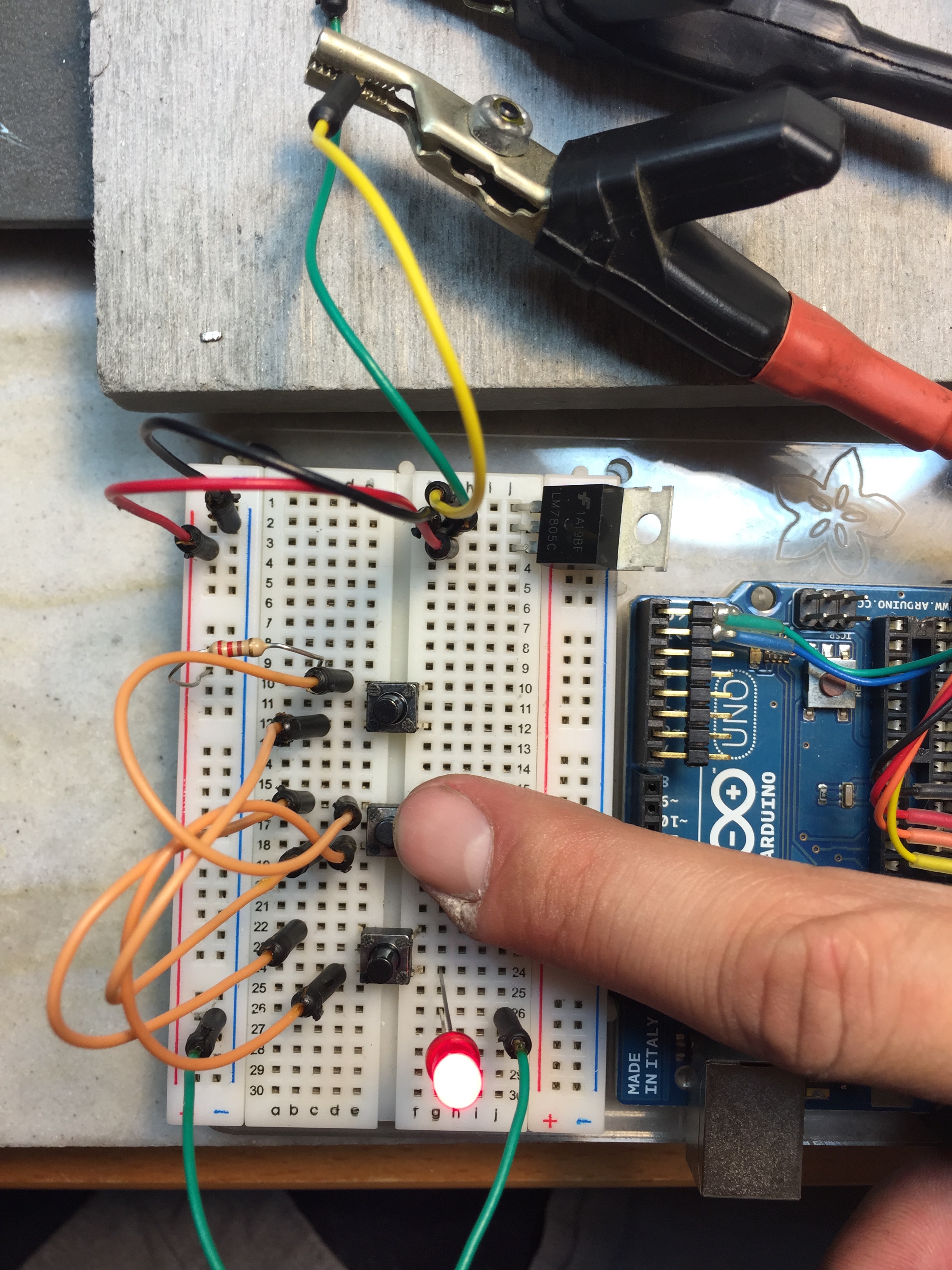
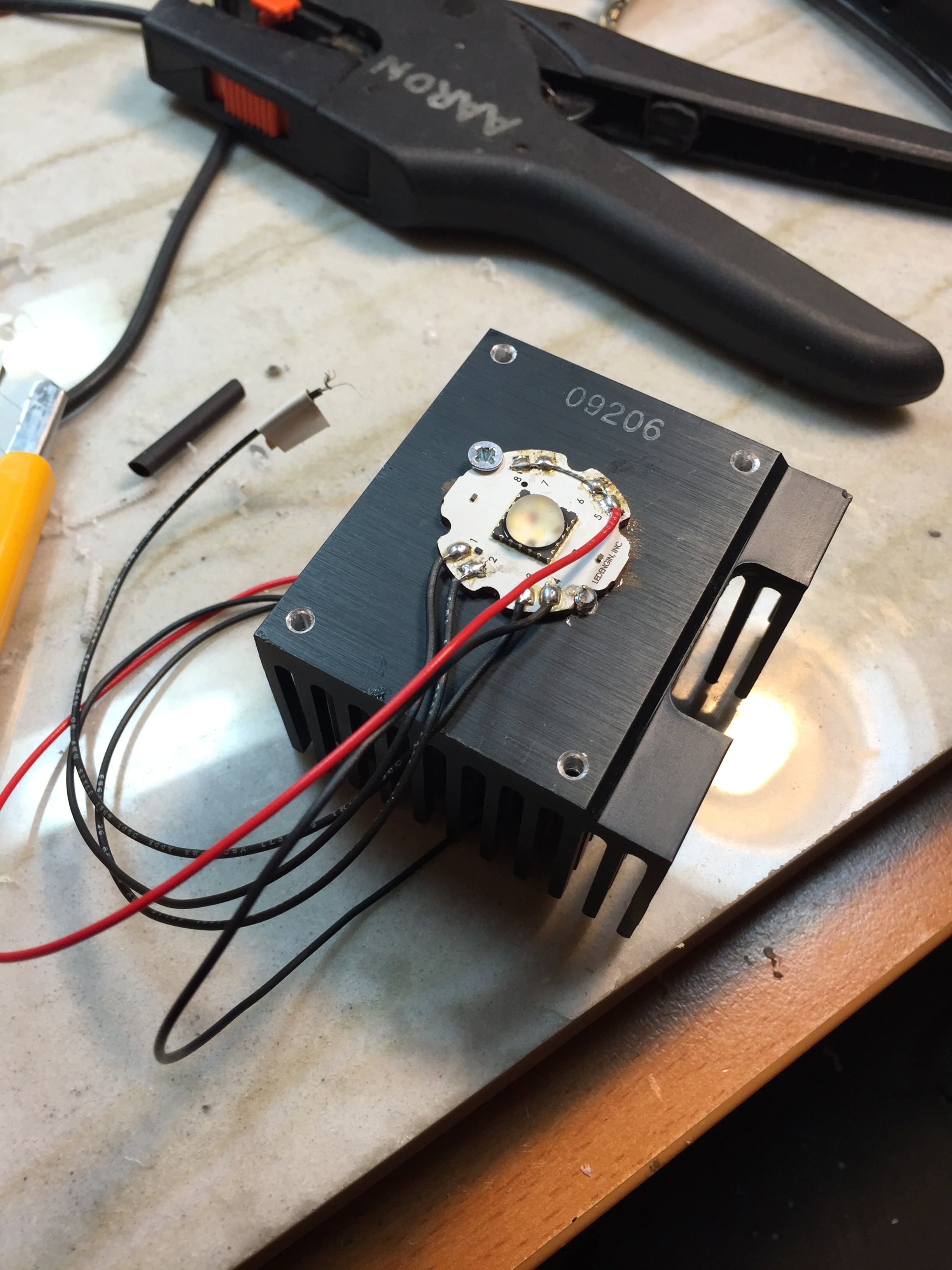
Finally I decided to work a little with outputting pulse width modulation to an LED, controlled via a sliding pot. Here is the simple code:


const int potPin = A0;
const int ledPin = 3;


int sensor = 0;
int output = 0;


void setup() {
}


void loop() {
sensor = analogRead(potPin);
output = map(sensor, 0, 1023, 0, 255);
analogWrite(ledPin, output);
}

Here is what it looks like on my oscilloscope while “dimming” 🙂

Assignment #3

This assignment was done as a collaboration with Xinyao Wang and myself.

Yao and I created a program that draws lines between random points within a big circle and a little circle. There are buttons at the top that toggle what color line is being drawn. Learning about the logic to create buttons that click and stay on was a huge step for me. Also watching Yao figure out the geometric equations at lighting speed was another huge step for me!

I was also really excited to learn that frameRate() works either way. For some reason I assumed that it could only be used to slow the default 60fps down. In our program on my new macbook pro, we have it running at 1800fps instead. Drawing these simple lines is no problem for a modern computer, even at 1800fps.

We used Adobe’s color wheel site to choose colors. It also happens to be an excellent example of interaction on the web:

https://color.adobe.com/create/color-wheel


screen2


screen1

And here is the code:

http://www.aaronparsekian.com/projects/ICMassignment3/

Programming this did not come without its frustrations! Mainly we tried everything to get rid of the horizontal line. It seems like the program enjoys writing horizontal lines very often.

I decided to keep up my projection theme. This time from a new angle:

IMG_0945

Here are some quick videos of it in action!


2nd Assignment – fun with very simple circuits

This week we went over buttons/switches, LED’s, and resistors. We also plugged in a 7805 5VDC voltage regulator.

Starting with the 7805:

volt across led

Looks like its doing its job! The meter is measuring voltage across the blue LED and the 220Ohm 1/8 watt resistor.

Up next we have two red LED’s in series with a 220Ohm resistor:

2 led series

2 led series volt across r

The 220Ohm resistor is drawing 1.4VDC.

Next up we have three red LED’s in parallel. I have lifted the left LED’s anode and put my amp meter in parallel. These sissy LED’s are only drawing 1.4mA.

Here we have an LED and a little motor in parallel:

motor led para

And finally a voltage divider made with a 10Kohm potentiometer:

volt divider

And now some switches! Not sure which one to use 🙂

switches

Here are three normally-open push buttons in parallel:

para switch

And here they are in series:

series sw


For my switch project I decided to have some fun with a 40watt RGBW LED. I stated by mounting it to an old pentium III heatsink, with some thermal compound in between:

led hs

Next I went to the data sheet. I’ve had this thing for four years . . . luckily mouser saves your purchase orders 🙂

I found the forward voltage ratings and decided to run this thing at 12VDC. The Green diodes forward voltage starts at 12.8V, but Im sure it’ll look fine at 12V. These are some big numbers to be seen for an LED. This LED certainly must be a package containing several dies per color. . .

Screen Shot 2015-09-16 at 1.00.28 AM

Even my awful math skills can figure this out 🙂

FullSizeRender 2

Next we add some switches:

led wired

Here is the final product!

led purple

Looks like we are drawing a happy healthy 520mA with a 12VDC input. For the white, the closest high power resistor I had was 3.9ohms instead of the 2.14ohms I calculated.

IMG_0841

This guy is painfully bright at 12VDC, so I think for class I will stick with a 9V battery.

led blu

2nd Assignment – Signage

This week we were asked to pick three examples of signage around the city that we felt was unsuccessful, and one that we like.

I have to say the first part of this assignment is almost too easy in NY:

FullSizeRender 3

I find this sign unsuccessful because the phrase ‘Human Hair’ doesn’t really make me feel beautiful. . .


FullSizeRender 2

This is one of my favorite unsuccessful signs that I constantly see at work. They are affixed to scissor lifts below waist level. Poor viewing placement aside, a lot of the rules are depicted confusingly, and some are just beyond obvious: (Don’t fall out of the lift). Its also pretty visually frustrating that they couldn’t come up with ONE more rule to make this thing symmetrical. There are three wind/storm-related rules, I could imagine it wouldn’t be too hard to come up with one more no-no. Maybe you are supposed to draw your own?


Somehow I knew the award for best-worst sign I would see would go to the MTA . . . .

IMG_0759 2

This sign is unsuccessful for two reasons. It definitely wins the “Not my Job” award for starters. An installer measured subway car doors off the first car marker and no solution was come up with where the doors align with a pole in the station. Regardless of the pole being in the way, in terms of directing people this sign is also useless . As a New Yorker I get that you are supposed to stand to the sides of the subway doors and let people off. Why is this information in the same block of yellow with the three arrows? Am I supposed to ‘step aside’ by backing up? The two white arrows aren’t much use either.

My version is pretty simple. The main change is that I am suggesting people walk into the brighter section instead of the black bars on the MTA version.

NEW_SIGN


Luckily there is hope for NYC in some places. I live in Greenpoint, Brooklyn next to several signage studios that hand paint advertisements. This is certainly a lost art. I really enjoy watching them paint these murals and signs. It gives a brand / logo / idea a different quality. As someone who tries to ignore ads as much as possible by not owning a TV, hating the radio, putting three ad-blockers on all my web browsers – I find that I cant help myself but to look at and enjoy the work these studios do. They also often times help businesses in my community by paining murals on the weekend. Such as this one:

IMG_0837

Assignment #2

This week we learned about how to control sketches with mouse and key inputs. I decided to write a sketch that could be used with a projector for a live performance.

It includes five different looks that are controlled via the q,w,e,r,t keys. The mouse is used for movement, and left mouse click clears the drawing.

The code is pretty simple. The main part of it runs off an ‘if’ statement linked to the five key presses. Each one uses variables to control color, size, and wether it is drawing a line or a point

screen1

Here is the projection setup 🙂


IMG_0779


IMG_0786


IMG_0787


The program itself: http://www.aaronparsekian.com/projects/ICMassignment2/

And a short video of it in action:

1st Assignment – What is physical interaction?

Physical interaction to me is when a human projects an action onto a computer or device, and that action is used to choose a response by said device intelligently. Interaction is not a direct translation, but rather an interpretation of an action and the reaction that follows. In my opinion, good physical interaction (in terms of technology) comes when a device has the capacity to understand slight nuances in a users action, and can respond to them quickly and in exactly the way the user had hoped for . . . maybe without even knowing the devices response was what they wanted.

A good example of technology that is not interactive would be forms of transducers. A simple two-way radio that is converting sound into radio waves is not interactive.

1st Assignment – Choose a design

CYRK Poster

001poster

The design I chose was a poster made for the circus in Poland. Following WWII, the polish government wanted to revamp the image of the circus in a modern fashion, and show off the arts and culture that were government sponsored at the time. I like this poster because it is a lively expression of circus shown in bright colors and smiles. It can be identified quickly from afar, and Im sure its colorful spirit was helpful on fences covering buildings damaged during the war.


001grid_system

Here I have outlined some of the underlining composition. The form of the performers arms, legs, and faces fit these guides very well.


negative_space

In this copy I have substituted the negative space with neutral grey. The cut-out style of the illustration makes for heavy contrast between the negative space and the other elements of the poster.


hierarchy


To me the hierarchy in this work begins with the smiling expressions of the performers, followed by the ‘Cyrk’ text (circus in Polish).


7colors


The seven vibrant colors used are a great representation of the subject matter, and successfully draw the viewer into a fun scene from afar.


Screen Shot 2015-09-08 at 12.13.15 PM copy


Finally, the single font used in this poster is a tough one to pinpoint. It has been heavily compressed and manipulated. I believe it is routed in Goudy Old Style, a serif typeface.

Goudy-Old-Style